Aliasing: fold \(f\) into \([0, f_s]\) via \(f \bmod f_s\), then reflect around \(f_s/2\)
Frequency folding rule
Basic
Exercise 1: Signal classification
Classify each signal as continuous-time (CT) or discrete-time (DT), and continuous-amplitude (CA) or discrete-amplitude (DA). If both time and amplitude are discrete, the signal is digital.
Air pressure measured by a barometer
Number of emails received per hour
Voltage output of a thermocouple
Daily closing price of a stock (in cents)
Audio from a CD (44.1 kHz, 16-bit)
Heart rate displayed on a fitness watch (integer BPM, updated every second)
Solution
Signal
Time
Amplitude
Classification
1. Barometer
CT
CA
Analog
2. Emails/hour
DT
DA
Digital
3. Thermocouple
CT
CA
Analog
4. Stock price
DT
DA
Digital (discrete time: once/day; discrete amplitude: integer cents)
5. CD audio
DT
DA
Digital (sampled at 44.1 kHz, quantized to 16 bits)
6. Heart rate
DT
DA
Digital
Key insight: a signal is digital when both time and amplitude are discrete. The barometer and thermocouple are analog because they vary continuously in both dimensions.
Exercise 2: Sampling period and frequency
Convert between sampling period and sampling frequency:
\(f_s = 44{,}100\) Hz (CD audio). What is \(T\)?
\(T = 1\) ms. What is \(f_s\)?
A sensor logs one reading every 15 minutes. What is \(f_s\) in Hz?
An oscilloscope samples at 1 GSa/s (giga-samples per second). What is \(T\)?
cases = [ ("CD audio", 44_100, None), ("1 ms sensor", None, 1e-3), ("15-min logger", None, 15*60), ("Oscilloscope", 1e9, None),]for name, fs, T in cases:if fs isnotNone: T =1/ fselse: fs =1/ Tprint(f"{name:16s} fs = {fs:>12.2f} Hz T = {T:.4e} s")
CD audio          fs =     44100.00 Hz   T = 2.2676e-05 s
1 ms sensor       fs =      1000.00 Hz   T = 1.0000e-03 s
15-min logger     fs =         0.00 Hz   T = 9.0000e+02 s
Oscilloscope      fs = 1000000000.00 Hz   T = 1.0000e-09 s
Exercise 3: Nyquist frequency
For each sampling rate, what is the Nyquist frequency (highest frequency that can be represented)?
\(f_s = 8{,}000\) Hz (telephone)
\(f_s = 48{,}000\) Hz (professional audio)
\(f_s = 2{,}000{,}000\) Hz (ultrasound imaging)
Solution
\[f_\text{nyq} = \frac{f_s}{2}\]
\(f_\text{nyq} = 4{,}000\) Hz, which is why telephone audio sounds “thin” (no content above 4 kHz)
\(f_\text{nyq} = 24{,}000\) Hz, comfortably above the ~20 kHz limit of human hearing
\(f_\text{nyq} = 1{,}000{,}000\) Hz = 1 MHz, sufficient for medical ultrasound frequencies
Exercise 4: Minimum sampling rate
What is the minimum sampling frequency required to avoid aliasing for each signal?
A pure 1 kHz sine wave
Human speech (frequency content up to 4 kHz)
A guitar chord with harmonics up to 12 kHz
An ECG signal with relevant content up to 150 Hz
Solution
The Nyquist theorem requires \(f_s > 2 f_\text{max}\):
\(f_s > 2 \times 1{,}000 = 2{,}000\) Hz
\(f_s > 2 \times 4{,}000 = 8{,}000\) Hz (this is exactly the telephone standard)
\(f_s > 2 \times 150 = 300\) Hz (medical ECG systems typically use 500–1000 Hz for safety margin)
In practice, you always sample somewhat above the theoretical minimum. The gap between \(2 f_\text{max}\) and the actual \(f_s\) gives the anti-aliasing filter room to roll off.
Intermediate
Exercise 5: Aliasing frequency calculation
A signal contains a sinusoidal component at frequency \(f_\text{in}\). It is sampled at \(f_s\). For each case, determine whether aliasing occurs and, if so, what frequency the component appears as in the sampled signal.
Hint: The alias frequency is \(f_\text{alias} = |f_\text{in} - k \cdot f_s|\) where \(k\) is the nearest integer to \(f_\text{in}/f_s\).
\(f_\text{in} = 300\) Hz, \(f_s = 1000\) Hz
\(f_\text{in} = 700\) Hz, \(f_s = 1000\) Hz
\(f_\text{in} = 1300\) Hz, \(f_s = 1000\) Hz
\(f_\text{in} = 60\) Hz, \(f_s = 50\) Hz
Solution
The general rule: fold into \([0, f_s]\) using \(f \bmod f_s\), then reflect around \(f_s/2\) if above it.
\(300 < f_s/2 = 500\) Hz → no aliasing, appears as 300 Hz.
\(1300 > 500\) Hz → aliasing. \(1300 \bmod 1000 = 300\); since \(300 < 500\): \(f_\text{alias} = 300\) Hz.
\(60 > f_s/2 = 25\) Hz → aliasing. \(60 \bmod 50 = 10\); since \(10 < 25\): \(f_\text{alias} = 10\) Hz. This is a real problem: 50 Hz mains hum aliasing into a low-frequency measurement.
import numpy as npdef alias_frequency(f_in, fs):"""Compute the apparent frequency after sampling."""# Fold into [0, fs] then reflect around fs/2 f_folded = f_in % fsif f_folded > fs /2: f_folded = fs - f_foldedreturn f_foldedcases = [(300, 1000), (700, 1000), (1300, 1000), (60, 50)]for f_in, fs in cases: f_alias = alias_frequency(f_in, fs) aliased = alias_frequency(f_in, fs) != f_in status ="ALIASED"if aliased else"ok"print(f"f_in={f_in:5d} Hz, fs={fs:4d} Hz → appears as {f_alias:5.0f} Hz [{status}]")
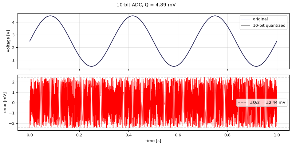
Resolution Q = 4.888 mV
Max error   = ±2.444 mV
Actual max  = 2.444 mV
The error is bounded by \(\pm Q/2\) and has a quasi-periodic sawtooth shape. For signals that are large relative to \(Q\), the quantization error behaves approximately like uniform white noise, a useful model for analysis.
Exercise 8: Kronecker delta algebra
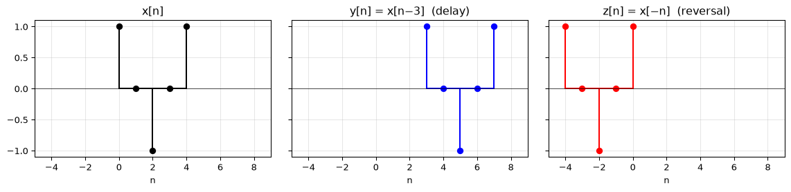
Express each of the following signals using Kronecker delta notation, then plot them.
You are designing a data acquisition system for an ultrasonic distance sensor. The sensor outputs frequencies up to 40 kHz, but you only care about the range 0–10 kHz. Your ADC samples at \(f_s = 25\) kHz.
What is the Nyquist frequency?
Without an anti-aliasing filter, which sensor frequencies would alias into your 0–10 kHz band of interest?
What cutoff frequency should the anti-aliasing filter have?
A real filter cannot cut off perfectly. It has a transition band. If your filter starts rolling off at 10 kHz and reaches full attenuation at 12.5 kHz, would frequencies in the transition band cause aliasing? Explain.
Solution
\(f_\text{nyq} = f_s / 2 = 12.5\) kHz.
Any frequency above 12.5 kHz will alias. Using the folding rule:
15 kHz → \(25 - 15 = 10\) kHz (aliases into band of interest)
20 kHz → \(20 \bmod 25 = 20\); \(25 - 20 = 5\) kHz (aliases into band of interest)
35 kHz → \(35 \bmod 25 = 10\) kHz (aliases into band of interest)
So the sensor’s ultrasonic content (15–40 kHz) folds right back into 0–10 kHz.
The anti-aliasing filter should have a cutoff at or below \(f_\text{nyq} = 12.5\) kHz. In practice, set it at 10 kHz (the highest frequency of interest) to give the filter’s transition band room to roll off before Nyquist.
The transition band spans 10–12.5 kHz. Frequencies in this range are below Nyquist (12.5 kHz), so they do not alias. They will appear at their true frequencies in the sampled signal, just attenuated. The filter design is correct: it passes the band of interest (0–10 kHz), partially attenuates 10–12.5 kHz, and fully blocks everything above 12.5 kHz that would alias.
import numpy as npimport matplotlib.pyplot as pltfs =25_000f_nyq = fs /2# Frequencies from the sensorf_sensor = np.array([5, 10, 15, 20, 25, 30, 35, 40]) *1000def alias_freq(f, fs): f_fold = f % fsreturn fs - f_fold if f_fold > fs /2else f_foldprint(f"{'Sensor freq':>12s}{'Alias freq':>12s}{'In band?':>8s}")print("-"*38)for f in f_sensor: fa = alias_freq(f, fs) in_band ="YES"if fa <=10_000else"no"print(f"{f/1000:10.0f} kHz {fa/1000:10.1f} kHz {in_band:>8s}")
A car wheel has 5 spokes and rotates at 10 revolutions per second. A camera films at 24 frames per second.
At what frequency do the spokes pass a fixed point?
What is the Nyquist frequency of the camera?
The wheel appears to rotate slowly on video. Explain this using aliasing. What apparent rotation rate and direction does the viewer see?
Solution
5 spokes × 10 rev/s = 50 Hz spoke frequency (50 spokes pass per second).
\(f_\text{nyq} = 24/2 = 12\) Hz.
50 Hz >> 12 Hz, so aliasing occurs. The alias frequency is: \(f_\text{alias} = |50 - 2 \times 24| = |50 - 48| = 2\) Hz.
The wheel appears to rotate at 2 spokes/second. Since \(50/24 \approx 2.08\) (just above 2), each frame the spokes have moved slightly more than two full spoke-spacings forward. The residual is \(+0.08\) spoke-spacings per frame, so the wheel appears to rotate slowly forward at 2 Hz.
This is the stroboscope effect (also called the “wagon wheel illusion”), and it’s aliasing in the time domain.
Exercise 11: Design an ADC system
You need to digitize a signal from an accelerometer that measures vibrations up to 2 kHz. The signal amplitude ranges from −5 V to +5 V, and you need at least 1 mV precision.
What is the minimum sampling frequency?
What is the minimum ADC bit depth for 1 mV precision over the ±5 V range?
What data rate (in bytes per second) does this produce, assuming one sample = one word (rounded up to the nearest standard word size: 8, 16, or 32 bits)?
How much storage is needed for a 24-hour recording?
Solution
\(f_s > 2 \times 2{,}000 = 4{,}000\) Hz. In practice, use at least 5 kHz to give the anti-aliasing filter room.
\(V_\text{FSR} = 10\) V. We need \(Q \leq 1\) mV, so \(2^M - 1 \geq 10{,}000\). Since \(2^{14} - 1 = 16{,}383\), we need 14-bit resolution.
14 bits rounds up to a 16-bit (2-byte) word. At 5 kHz: \(5{,}000 \times 2 = 10{,}000\) bytes/s ≈ 10 kB/s.
Min sampling freq:  4000 Hz (using 5000 Hz)
Min bit depth:      14 bits → Q = 0.610 mV
Data rate:          10,000 bytes/s (10 kB/s)
24-hour storage:    864,000,000 bytes (864 MB)
Exercise 12: Aliasing explorer
Write a Python function aliasing_demo(f_signal, fs) that:
Plots the continuous signal and its samples over 2 periods of the lowest visible frequency
If aliasing occurs, also plots the alias frequency sinusoid
Prints whether aliasing occurs and the apparent frequency
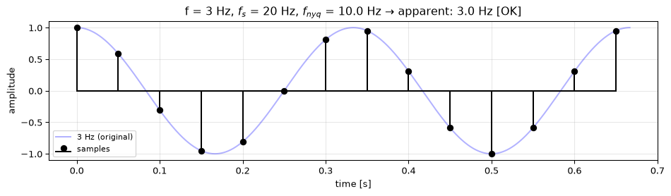
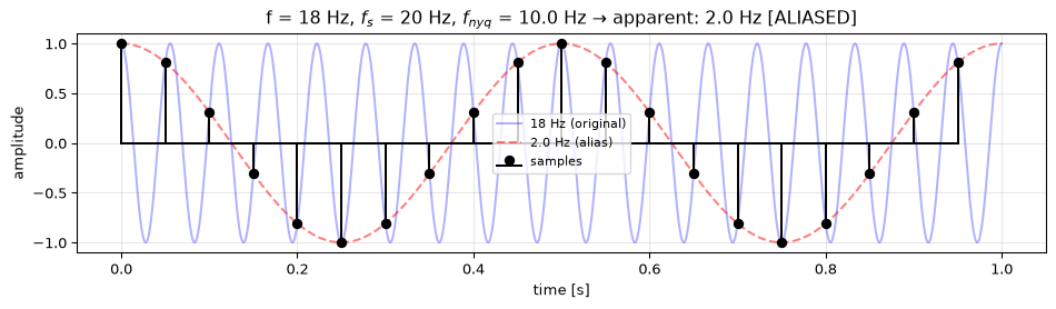
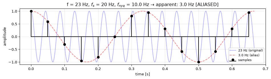
Test it with: (a) \(f = 3\) Hz, \(f_s = 20\) Hz; (b) \(f = 18\) Hz, \(f_s = 20\) Hz; (c) \(f = 23\) Hz, \(f_s = 20\) Hz.
Solution
import numpy as npimport matplotlib.pyplot as pltdef aliasing_demo(f_signal, fs):"""Visualize sampling and aliasing for a given signal frequency.""" f_nyq = fs /2# Compute alias frequency f_apparent = f_signal % fsif f_apparent > f_nyq: f_apparent = fs - f_apparent aliased = f_signal > f_nyq# Time axis: 2 periods of the apparent frequencyif f_apparent >0: duration =2/ f_apparentelse: duration =2/ f_signal t_fine = np.linspace(0, duration, 5000) n_samples =int(np.ceil(duration * fs)) t_samples = np.arange(n_samples) / fs fig, ax = plt.subplots(figsize=(10, 3))# Original signal ax.plot(t_fine, np.cos(2* np.pi * f_signal * t_fine),'b-', alpha=0.3, label=f'{f_signal} Hz (original)')# Alias signal (if different)if aliased: ax.plot(t_fine, np.cos(2* np.pi * f_apparent * t_fine),'r--', alpha=0.5, label=f'{f_apparent:.1f} Hz (alias)')# Samples ax.stem(t_samples, np.cos(2* np.pi * f_signal * t_samples), linefmt='k-', markerfmt='ko', basefmt='k-', label='samples') status ="ALIASED"if aliased else"OK" ax.set_title(f'f = {f_signal} Hz, $f_s$ = {fs} Hz, 'f'$f_{{nyq}}$ = {f_nyq} Hz → apparent: {f_apparent:.1f} Hz [{status}]') ax.set_xlabel('time [s]') ax.set_ylabel('amplitude') ax.legend(fontsize=8) ax.grid(True, alpha=0.3) plt.tight_layout() plt.show()# Test casesaliasing_demo(3, 20) # (a) well below Nyquistaliasing_demo(18, 20) # (b) close to fs — aliases to 2 Hzaliasing_demo(23, 20) # (c) above fs — aliases to 3 Hz
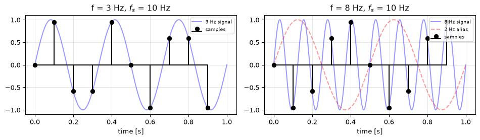
Note that case (c) gives the same samples as case (a): 23 Hz and 3 Hz are indistinguishable at \(f_s = 20\) Hz. This is the fundamental problem with aliasing: information is irreversibly lost.
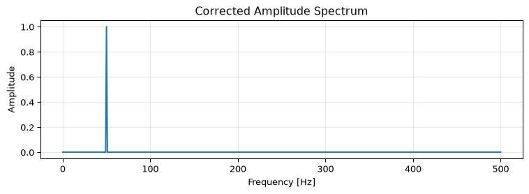
The following Python code is meant to compute and plot the amplitude spectrum of a 50 Hz sinusoid sampled at 1000 Hz. It contains two bugs. Find and fix them both.
Hint: Think about (a) which frequency bins are meaningful for a real-valued signal, and (b) the relationship between the FFT output magnitude and the actual signal amplitude.
Solution
Bug 1: The code uses np.fft.fft and plots all N bins, including negative frequencies. For a real-valued signal, the negative-frequency half is a mirror image. It adds no information and makes the plot confusing. Use np.fft.rfft and np.fft.rfftfreq to get only the non-negative frequencies.
Bug 2: The code plots np.abs(X) directly, but the FFT magnitudes scale with N (the number of samples). To get the true amplitude, divide by N. For a one-sided spectrum (rfft), multiply by 2 to account for the energy in the discarded negative-frequency half (except at DC and Nyquist).
Corrected code:
import numpy as npimport matplotlib.pyplot as pltfs =1000t = np.arange(0, 1, 1/fs)x = np.sin(2* np.pi *50* t)# Fix 1: use rfft for real-valued signalsX = np.fft.rfft(x)freqs = np.fft.rfftfreq(len(x), 1/fs)# Fix 2: normalize by N, multiply by 2 for one-sided spectrumN =len(x)amplitude =2* np.abs(X) / Namplitude[0] /=2# DC bin: no factor of 2if N %2==0: amplitude[-1] /=2# Nyquist bin: no factor of 2plt.figure(figsize=(8, 3))plt.plot(freqs, amplitude)plt.xlabel('Frequency [Hz]')plt.ylabel('Amplitude')plt.title('Corrected Amplitude Spectrum')plt.grid(True, alpha=0.3)plt.tight_layout()plt.show()print(f"Peak at {freqs[np.argmax(amplitude)]:.0f} Hz with amplitude {np.max(amplitude):.4f}")print("Expected: peak at 50 Hz with amplitude 1.0")
Peak at 50 Hz with amplitude 1.0000
Expected: peak at 50 Hz with amplitude 1.0
The corrected spectrum shows a single clean peak at 50 Hz with amplitude 1.0, matching the original sinusoid’s amplitude.
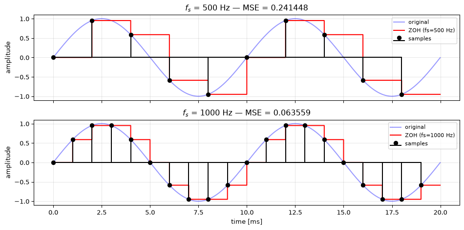
Sample a 100 Hz sinusoid at two different rates: \(f_s = 500\) Hz and \(f_s = 1000\) Hz. Simulate zero-order hold (ZOH) reconstruction by repeating each sample value until the next sample arrives (use np.repeat). Compare the reconstructed signals against the original continuous-time waveform.
At which sample rate is the staircase reconstruction closer to the original?
Quantify the difference using mean squared error (MSE).
Solution
Higher sample rates produce a finer staircase that tracks the original more closely. At \(f_s = 1000\) Hz (10× oversampling), the ZOH output is much closer to the true sinusoid than at \(f_s = 500\) Hz (5× oversampling).
import numpy as npimport matplotlib.pyplot as pltf_sig =100# Hzduration =0.02# 2 periods# "Continuous" reference at very high ratefs_ref =100_000t_ref = np.arange(0, duration, 1/fs_ref)x_ref = np.sin(2* np.pi * f_sig * t_ref)fig, axes = plt.subplots(2, 1, figsize=(10, 5), sharex=True)for ax, fs inzip(axes, [500, 1000]):# Sample the signal t_samples = np.arange(0, duration, 1/fs) x_samples = np.sin(2* np.pi * f_sig * t_samples)# ZOH reconstruction: repeat each sample to fill the interval upsample_factor =int(fs_ref / fs) x_zoh = np.repeat(x_samples, upsample_factor)# Trim to match reference length n_pts =min(len(x_zoh), len(t_ref)) x_zoh = x_zoh[:n_pts] t_zoh = t_ref[:n_pts] x_ref_trimmed = x_ref[:n_pts]# Compute MSE mse = np.mean((x_zoh - x_ref_trimmed) **2) ax.plot(t_ref *1000, x_ref, 'b-', alpha=0.4, label='original') ax.step(t_zoh *1000, x_zoh, 'r-', where='post', label=f'ZOH (fs={fs} Hz)') ax.stem(t_samples *1000, x_samples, linefmt='k-', markerfmt='ko', basefmt='k-', label='samples') ax.set_ylabel('amplitude') ax.set_title(f'$f_s$ = {fs} Hz — MSE = {mse:.6f}') ax.legend(fontsize=8) ax.grid(True, alpha=0.3)axes[1].set_xlabel('time [ms]')plt.tight_layout()plt.show()
The MSE at \(f_s = 1000\) Hz is roughly 4× smaller than at \(f_s = 500\) Hz. This illustrates why practical systems oversample: even simple ZOH reconstruction benefits greatly from higher sample rates, and the remaining staircase artifacts are easier to remove with a smooth low-pass reconstruction filter.
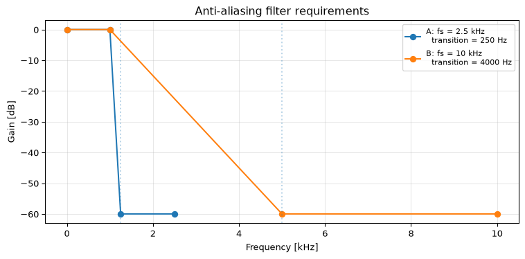
Exercise 15: Oversampling benefit (Intermediate)
A signal has a bandwidth of 1 kHz. You are comparing two sampling strategies:
Strategy A:\(f_s = 2.5\) kHz (just above Nyquist)
Strategy B:\(f_s = 10\) kHz (4× oversampling)
For each strategy, what is the Nyquist frequency?
The anti-aliasing filter must pass 0–1 kHz and fully attenuate signals at the Nyquist frequency and above. Calculate the transition band width for each case (from the signal bandwidth to the Nyquist frequency).
Which strategy requires a steeper (higher-order) filter? Why does this matter in practice?
Solution
Nyquist frequency \(= f_s / 2\):
Strategy A: \(f_\text{nyq} = 1.25\) kHz
Strategy B: \(f_\text{nyq} = 5\) kHz
Transition band \(= f_\text{nyq} - f_\text{max}\):
Strategy A: \(1.25 - 1.0 = 0.25\) kHz (250 Hz)
Strategy B: \(5.0 - 1.0 = 4.0\) kHz (4000 Hz)
Strategy A has a transition band 16× narrower than Strategy B. This requires a much steeper filter: higher order, more components, more cost, and more phase distortion in analog implementations. Strategy B gives the anti-aliasing filter a very relaxed transition band, so even a simple 2nd-order filter can achieve adequate attenuation.
This is why oversampling is popular in practice: it trades a faster (cheaper) ADC for a much simpler (cheaper, better-behaved) anti-aliasing filter. The extra samples can later be decimated down to the required rate after digital filtering.
Exercise 16: Real ADC specifications (Intermediate)
An ADC datasheet lists the following specifications:
Resolution: 16-bit
Maximum sample rate: 100 kSPS
Input range: ±5 V
INL (integral nonlinearity): ±2 LSB
ENOB (effective number of bits): 14.2 bits
Calculate:
The voltage resolution (1 LSB) in microvolts.
The theoretical SNR based on the 16-bit word length.
The actual SNR based on the ENOB.
Why is the ENOB significantly less than 16? What does the difference tell you?
Theoretical SNR from bit count, using the standard formula for uniformly distributed quantization noise: \[\text{SNR}_\text{theory} = 6.02 \times M + 1.76 = 6.02 \times 16 + 1.76 = 98.1\;\text{dB}\]
Actual SNR from ENOB: \[\text{SNR}_\text{actual} = 6.02 \times \text{ENOB} + 1.76 = 6.02 \times 14.2 + 1.76 = 87.2\;\text{dB}\]
The ENOB is 1.8 bits less than the nominal resolution. This gap accounts for all real-world imperfections: thermal noise in the ADC circuitry, nonlinearity (INL of ±2 LSB means the transfer function deviates from a perfect staircase), clock jitter, and differential nonlinearity. The bottom 1.8 bits are essentially noise, not useful signal information. The ENOB tells you the true resolving power of the converter.
import numpy as npM =16V_FSR =10.0# ±5 VENOB =14.2INL =2# LSBQ = V_FSR /2**M # Approximation for large M; exact form is V_FSR / (2**M - 1)SNR_theory =6.02* M +1.76SNR_actual =6.02* ENOB +1.76lost_bits = M - ENOBprint(f"(a) Voltage resolution: {Q*1e6:.1f} µV ({Q*1e3:.3f} mV)")print(f"(b) Theoretical SNR: {SNR_theory:.1f} dB (from {M}-bit word)")print(f"(c) Actual SNR (ENOB): {SNR_actual:.1f} dB (from ENOB = {ENOB})")print(f"(d) Lost bits: {lost_bits:.1f} bits")print(f" → bottom {lost_bits:.1f} bits are noise, not signal")print(f" → INL of ±{INL} LSB alone accounts for part of this")
(a) Voltage resolution: 152.6 µV  (0.153 mV)
(b) Theoretical SNR:    98.1 dB  (from 16-bit word)
(c) Actual SNR (ENOB):  87.2 dB  (from ENOB = 14.2)
(d) Lost bits:          1.8 bits
    → bottom 1.8 bits are noise, not signal
    → INL of ±2 LSB alone accounts for part of this
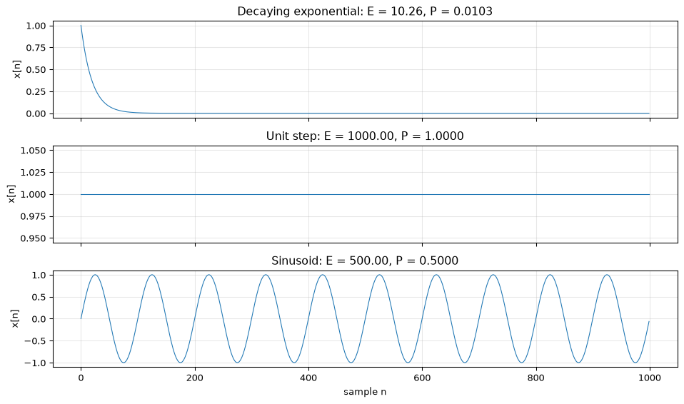
Exercise 17: Signal energy in Python (Intermediate)
Generate three signals, each with \(N = 1000\) samples at \(f_s = 1000\) Hz:
A decaying exponential: \(x_1[n] = 0.95^n\)
A unit step: \(x_2[n] = u[n]\) (all ones for \(n \geq 0\))
A sinusoid: \(x_3[n] = \sin(2\pi \cdot 10 \cdot n / f_s)\)
For each signal, compute:
The energy: \(E = \sum_{n} |x[n]|^2\)
The average power: \(P = \frac{1}{N} \sum_{n} |x[n]|^2\)
Which are energy signals (finite energy, zero average power as \(N \to \infty\)) and which are power signals (finite average power, infinite energy as \(N \to \infty\))?
Solution
import numpy as npimport matplotlib.pyplot as pltN =1000fs =1000n = np.arange(N)# Generate signalsx1 =0.95** n # decaying exponentialx2 = np.ones(N) # unit stepx3 = np.sin(2* np.pi *10* n / fs) # sinusoidsignals = [("Decaying exponential", x1), ("Unit step", x2), ("Sinusoid", x3)]fig, axes = plt.subplots(3, 1, figsize=(10, 6), sharex=True)for ax, (name, x) inzip(axes, signals): energy = np.sum(x **2) power = np.mean(x **2) ax.plot(n, x, linewidth=0.8) ax.set_title(f'{name}: E = {energy:.2f}, P = {power:.4f}') ax.set_ylabel('x[n]') ax.grid(True, alpha=0.3)print(f"{name:25s} Energy = {energy:10.2f} Avg power = {power:.4f}")axes[-1].set_xlabel('sample n')plt.tight_layout()plt.show()
Decaying exponential       Energy =      10.26   Avg power = 0.0103
Unit step                  Energy =    1000.00   Avg power = 1.0000
Sinusoid                   Energy =     500.00   Avg power = 0.5000
Classification:
Decaying exponential (\(0.95^n\)): This is an energy signal. The geometric series \(\sum 0.95^{2n}\) converges to \(1/(1 - 0.95^2) \approx 10.26\). The energy is finite and the average power approaches zero as \(N \to \infty\).
Unit step: This is a power signal. Energy grows linearly with \(N\) (it is \(N\)), so it is infinite for an infinite-length signal. Average power is constant at 1.0.
Sinusoid: This is a power signal. Energy grows linearly with \(N\), but average power converges to \(1/2 = 0.5\) (the mean-square value of a unit-amplitude sine). For an infinite-length signal, energy is infinite but power is finite.
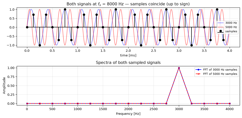
Exercise 18: Aliasing in audio (Challenge)
Generate a 3 kHz sinusoid sampled at \(f_s = 8\) kHz (telephone quality). The Nyquist frequency is 4 kHz, so 3 kHz is safely below it.
Now generate a 5 kHz sinusoid at the same sample rate. According to the folding rule, 5 kHz should alias to \(f_s - 5000 = 3000\) Hz.
Verify that the discrete-time samples of the 5 kHz and 3 kHz sinusoids are identical up to a sign flip.
Plot both continuous-time signals and their samples to show visually that the samples coincide.
What would an anti-aliasing filter need to do to prevent this?
Solution
import numpy as npimport matplotlib.pyplot as pltfs =8000f1 =3000# below Nyquistf2 =5000# above Nyquist → aliases to fs - 5000 = 3000 Hz# Discrete-time samplesN =32n = np.arange(N)x1 = np.sin(2* np.pi * f1 * n / fs)x2 = np.sin(2* np.pi * f2 * n / fs)# (a) Check that samples are identical# sin(2π·5000·n/8000) = sin(2π·n·5/8) = sin(2π·n - 2π·n·3/8) = -sin(2π·3000·n/8000)# Note: they may differ by a sign depending on the phase relationshipprint("Max difference |x1 - x2|:", np.max(np.abs(x1 - x2)))print("Max difference |x1 + x2|:", np.max(np.abs(x1 + x2)))# One of these should be ~0# (b) Plott_fine = np.linspace(0, N/fs, 10000)t_samples = n / fsfig, axes = plt.subplots(2, 1, figsize=(10, 5))# Top: both continuous signals with shared samplesaxes[0].plot(t_fine *1000, np.sin(2* np.pi * f1 * t_fine),'b-', alpha=0.5, label=f'{f1} Hz')axes[0].plot(t_fine *1000, np.sin(2* np.pi * f2 * t_fine),'r-', alpha=0.5, label=f'{f2} Hz')axes[0].stem(t_samples *1000, x1, linefmt='k-', markerfmt='ko', basefmt='k-', label='samples')axes[0].set_title(f'Both signals at $f_s$ = {fs} Hz — samples coincide (up to sign)')axes[0].set_xlabel('time [ms]')axes[0].legend(fontsize=8)axes[0].grid(True, alpha=0.3)# Bottom: overlay the sampled spectrafreqs = np.fft.rfftfreq(N, 1/fs)X1 = np.abs(np.fft.rfft(x1)) / N *2X2 = np.abs(np.fft.rfft(x2)) / N *2axes[1].plot(freqs, X1, 'b-o', markersize=4, label=f'FFT of {f1} Hz samples')axes[1].plot(freqs, X2, 'r--x', markersize=4, label=f'FFT of {f2} Hz samples')axes[1].set_xlabel('Frequency [Hz]')axes[1].set_ylabel('Amplitude')axes[1].set_title('Spectra of both sampled signals')axes[1].legend(fontsize=8)axes[1].grid(True, alpha=0.3)plt.tight_layout()plt.show()
Max difference |x1 - x2|: 2.0
Max difference |x1 + x2|: 9.658940314238862e-15
Explanation: The 5 kHz sinusoid, when sampled at 8 kHz, produces samples identical (up to a possible sign flip) to the 3 kHz sinusoid. This is because \(\sin(2\pi \cdot 5000 \cdot n/8000) = \sin(2\pi n - 2\pi \cdot 3000 \cdot n/8000) = -\sin(2\pi \cdot 3000 \cdot n/8000)\). The folding rule \(f_\text{alias} = f_s - f = 8000 - 5000 = 3000\) Hz predicts this exactly.
(c) An anti-aliasing low-pass filter with cutoff below 4 kHz (the Nyquist frequency) must be applied before sampling. This analog filter attenuates the 5 kHz component so it cannot corrupt the 3 kHz content after sampling. Once the signal is sampled, the aliasing is irreversible.
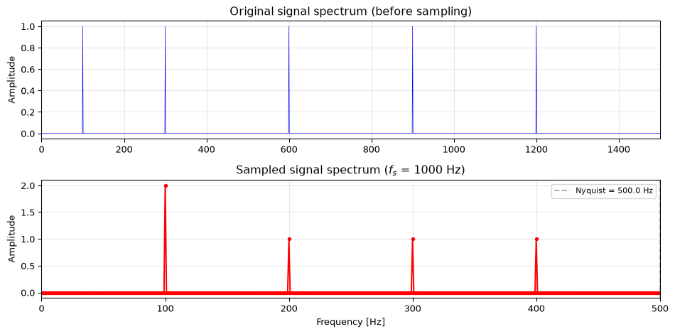
Exercise 19: Multi-tone aliasing (Challenge)
A signal contains sinusoidal components at 100, 300, 600, 900, and 1200 Hz. It is sampled at \(f_s = 1000\) Hz, so the Nyquist frequency is 500 Hz.
Use the folding rule to determine the apparent frequency of each component after sampling.
Which original components will overlap (appear at the same frequency) in the sampled signal?
Verify your answers with Python: generate the multi-tone signal, sample it, and compute the FFT.
Solution
(a) Apply the folding rule to each component:
Original freq
\(f \bmod f_s\)
Above \(f_s/2\)?
Apparent freq
100 Hz
100
No
100 Hz
300 Hz
300
No
300 Hz
600 Hz
600
Yes
$1000 - 600 = $ 400 Hz
900 Hz
900
Yes
$1000 - 900 = $ 100 Hz
1200 Hz
200
No
200 Hz
(b) The 100 Hz and 900 Hz components both appear at 100 Hz. They overlap and cannot be separated after sampling. All other components land at distinct frequencies.
import numpy as npimport matplotlib.pyplot as pltfs =1000f_nyq = fs /2freqs_orig = [100, 300, 600, 900, 1200]# (a) Folding ruledef fold(f, fs): f_mod = f % fsreturn fs - f_mod if f_mod > fs /2else f_modprint("Folding analysis:")print(f"{'Original':>10s}{'Apparent':>10s}{'Aliased?':>8s}")for f in freqs_orig: fa = fold(f, fs)print(f"{f:>8d} Hz {fa:>8d} Hz {'YES'if fa != f else'no':>8s}")# (c) Verify with FFTduration =1.0# 1 second for 1 Hz frequency resolution# Generate "continuous" multi-tone signal at high ratefs_high =100_000t_high = np.arange(0, duration, 1/fs_high)x_high =sum(np.cos(2* np.pi * f * t_high) for f in freqs_orig)# Sample at fs = 1000 Hzt_sampled = np.arange(0, duration, 1/fs)x_sampled =sum(np.cos(2* np.pi * f * t_sampled) for f in freqs_orig)# Compute spectraN =len(x_sampled)X = np.fft.rfft(x_sampled)f_axis = np.fft.rfftfreq(N, 1/fs)amplitude =2* np.abs(X) / Nfig, axes = plt.subplots(2, 1, figsize=(10, 5))# Original spectrum (simulated)N_high =len(x_high)X_high = np.fft.rfft(x_high)f_high = np.fft.rfftfreq(N_high, 1/fs_high)amp_high =2* np.abs(X_high) / N_highaxes[0].plot(f_high, amp_high, 'b-', linewidth=0.5)axes[0].set_xlim(0, 1500)axes[0].set_title('Original signal spectrum (before sampling)')axes[0].set_ylabel('Amplitude')axes[0].grid(True, alpha=0.3)# Sampled spectrumaxes[1].plot(f_axis, amplitude, 'r-o', markersize=3)axes[1].set_xlim(0, f_nyq)axes[1].set_title(f'Sampled signal spectrum ($f_s$ = {fs} Hz)')axes[1].set_xlabel('Frequency [Hz]')axes[1].set_ylabel('Amplitude')axes[1].grid(True, alpha=0.3)axes[1].axvline(f_nyq, color='k', linestyle='--', alpha=0.3, label=f'Nyquist = {f_nyq} Hz')axes[1].legend(fontsize=8)plt.tight_layout()plt.show()
Folding analysis:
  Original    Apparent  Aliased?
     100 Hz       100 Hz        no
     300 Hz       300 Hz        no
     600 Hz       400 Hz       YES
     900 Hz       100 Hz       YES
    1200 Hz       200 Hz       YES
The sampled spectrum shows a peak at 100 Hz with roughly twice the amplitude of the others. This is the 100 Hz and 900 Hz components summing together. The 1200 Hz component appears at 200 Hz, and the 600 Hz component appears at 400 Hz. The 300 Hz component is the only one that passes through unaffected.
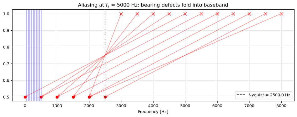
You are designing a vibration monitoring system for an industrial motor. The motor runs at 3000 RPM (fundamental frequency = 50 Hz), and you need to capture up to the 10th harmonic (500 Hz). You also want to detect bearing defects, which produce characteristic frequencies in the 2–8 kHz range.
What minimum sample rate covers the motor harmonics only (up to 500 Hz)?
What minimum sample rate is needed to also capture bearing defect frequencies (up to 8 kHz)?
If your ADC can only sample at \(f_s = 5\) kHz, which bearing-defect frequencies alias, and where do they appear in the spectrum?
Solution
(a) For harmonics up to 500 Hz: \(f_s > 2 \times 500 = 1000\) Hz. In practice, use at least 1.5–2 kHz to allow for an anti-aliasing filter transition band.
(b) For bearing defects up to 8 kHz: \(f_s > 2 \times 8000 = 16{,}000\) Hz. Use at least 20 kHz in practice.
(c) At \(f_s = 5\) kHz, the Nyquist frequency is 2.5 kHz. Bearing defect frequencies from 2.5–8 kHz will alias:
import numpy as npimport matplotlib.pyplot as pltfs =5000f_nyq = fs /2def fold(f, fs): f_mod = f % fsreturn fs - f_mod if f_mod > fs /2else f_mod# Motor harmonicsprint("Motor harmonics (50 Hz fundamental):")harmonics = [50* k for k inrange(1, 11)]for f in harmonics: fa = fold(f, fs) status ="OK"if fa == f elsef"ALIASED → {fa} Hz"print(f" Harmonic {f//50:2d}: {f:5d} Hz {status}")# Bearing defect frequencies (example range)print(f"\nBearing defect frequencies (2-8 kHz), fs = {fs} Hz:")bearing_freqs = np.arange(2000, 8500, 500)print(f"{'Original':>10s}{'Apparent':>10s}{'Problem?':>12s}")for f in bearing_freqs: fa = fold(f, fs) in_harmonic_band = fa <=500 problem ="MASKS HARMONIC"if in_harmonic_band else ("aliased"if fa != f else"ok")print(f"{f:>8d} Hz {fa:>8d} Hz {problem:>14s}")# Visualize the aliasingfig, ax = plt.subplots(figsize=(10, 4))# Plot original bearing frequencies and their aliasesfor f in bearing_freqs: fa = fold(f, fs)if fa != f: ax.annotate('', xy=(fa, 0.5), xytext=(f, 1.0), arrowprops=dict(arrowstyle='->', color='red', alpha=0.5)) ax.plot(f, 1.0, 'rx', markersize=8) ax.plot(fa, 0.5, 'ro', markersize=6)# Plot motor harmonicsfor f in harmonics: ax.axvline(f, color='blue', alpha=0.3, linewidth=2)ax.axvline(f_nyq, color='k', linestyle='--', label=f'Nyquist = {f_nyq} Hz')ax.set_xlabel('Frequency [Hz]')ax.set_title(f'Aliasing at $f_s$ = {fs} Hz: bearing defects fold into baseband')ax.legend()ax.grid(True, alpha=0.3)plt.tight_layout()plt.show()
Motor harmonics (50 Hz fundamental):
  Harmonic  1:    50 Hz  OK
  Harmonic  2:   100 Hz  OK
  Harmonic  3:   150 Hz  OK
  Harmonic  4:   200 Hz  OK
  Harmonic  5:   250 Hz  OK
  Harmonic  6:   300 Hz  OK
  Harmonic  7:   350 Hz  OK
  Harmonic  8:   400 Hz  OK
  Harmonic  9:   450 Hz  OK
  Harmonic 10:   500 Hz  OK

Bearing defect frequencies (2-8 kHz), fs = 5000 Hz:
  Original    Apparent      Problem?
    2000 Hz      2000 Hz              ok
    2500 Hz      2500 Hz              ok
    3000 Hz      2000 Hz         aliased
    3500 Hz      1500 Hz         aliased
    4000 Hz      1000 Hz         aliased
    4500 Hz       500 Hz  MASKS HARMONIC
    5000 Hz         0 Hz  MASKS HARMONIC
    5500 Hz       500 Hz  MASKS HARMONIC
    6000 Hz      1000 Hz         aliased
    6500 Hz      1500 Hz         aliased
    7000 Hz      2000 Hz         aliased
    7500 Hz      2500 Hz         aliased
    8000 Hz      2000 Hz         aliased
Several bearing defect frequencies alias into the 0–500 Hz motor harmonic band, making them indistinguishable from real harmonics. For example, 5000 Hz aliases to 0 Hz (DC), 4500 Hz aliases to 500 Hz (overlapping the 10th harmonic). This is why vibration monitoring systems for bearing diagnostics require high sample rates (typically 20+ kHz) or must use an anti-aliasing filter to explicitly reject the bearing-frequency band if only harmonics are needed.
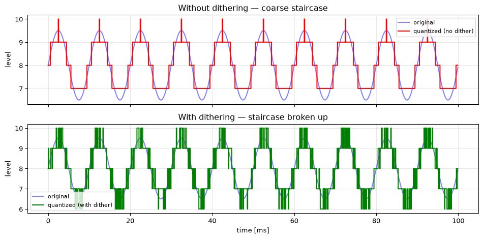
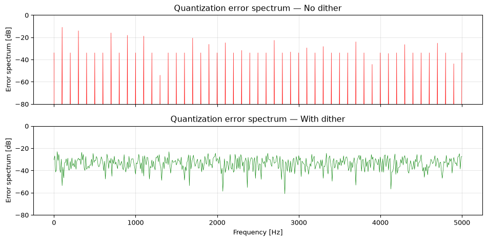
Exercise 21: Quantization dithering (Challenge)
Quantize a low-amplitude sinusoid (amplitude = 1.5 LSB) at 4-bit resolution, both with and without dithering. Dithering adds a small amount of random noise (uniform, ±0.5 LSB) before quantization.
Generate a 4-bit quantized version of the sinusoid without dithering. Plot the waveform: you should see a coarse staircase with visible distortion.
Add uniform dither noise before quantizing. Plot the dithered result: the staircase pattern should break up.
Compare the spectra (FFT) of both quantized signals. Show that dithering reduces harmonic distortion by spreading quantization error into broadband noise.
Without dither:
  Quantization error std: 0.3281 LSB
With dither:
  Quantization error std: 0.4323 LSB
Key observation: Without dithering, the error spectrum shows strong harmonic peaks. The quantization distortion is correlated with the signal, producing audible (or measurable) spurious tones. With dithering, the error energy is spread across all frequencies as broadband noise. The total error power is slightly larger with dithering, but the harmonic distortion is dramatically reduced. This tradeoff (trading coherent distortion for incoherent noise) is fundamental in audio and measurement systems.
Source Code
---title: "Exercises: Signals and Sampling"subtitle: "Practice problems for Chapter 1"---These exercises accompany [Chapter 1: Signals and Sampling](../basics/01-signals.qmd).::: {.callout-note title="Key formulas for this chapter"}| Formula | Description ||---------|-------------|| $f_s = 1/T$ | Sampling frequency and period || $f_{\text{Nyquist}} = f_s / 2$ | Maximum representable frequency || $Q = V_{\text{FSR}} / (2^M - 1)$ | Quantization step size (M bits) || $\text{SNR}_q = 6.02M + 1.76$ dB | Quantization SNR for full-scale sinusoid || Aliasing: fold $f$ into $[0, f_s]$ via $f \bmod f_s$, then reflect around $f_s/2$ | Frequency folding rule |:::## Basic::: {.callout-tip collapse="true" title="Exercise 1: Signal classification"}Classify each signal as **continuous-time** (CT) or **discrete-time** (DT), and **continuous-amplitude** (CA) or **discrete-amplitude** (DA). If both time and amplitude are discrete, the signal is **digital**.1. Air pressure measured by a barometer2. Number of emails received per hour3. Voltage output of a thermocouple4. Daily closing price of a stock (in cents)5. Audio from a CD (44.1 kHz, 16-bit)6. Heart rate displayed on a fitness watch (integer BPM, updated every second)::: {.callout-note collapse="true" title="Solution"}| Signal | Time | Amplitude | Classification ||--------|------|-----------|---------------|| 1. Barometer | CT | CA | Analog || 2. Emails/hour | DT | DA | Digital || 3. Thermocouple | CT | CA | Analog || 4. Stock price | DT | DA | Digital (discrete time: once/day; discrete amplitude: integer cents) || 5. CD audio | DT | DA | Digital (sampled at 44.1 kHz, quantized to 16 bits) || 6. Heart rate | DT | DA | Digital |Key insight: a signal is digital when *both* time and amplitude are discrete. The barometer and thermocouple are analog because they vary continuously in both dimensions.::::::::: {.callout-tip collapse="true" title="Exercise 2: Sampling period and frequency"}Convert between sampling period and sampling frequency:a) $f_s = 44{,}100$ Hz (CD audio). What is $T$?b) $T = 1$ ms. What is $f_s$?c) A sensor logs one reading every 15 minutes. What is $f_s$ in Hz?d) An oscilloscope samples at 1 GSa/s (giga-samples per second). What is $T$?::: {.callout-note collapse="true" title="Solution"}$$T = \frac{1}{f_s}, \quad f_s = \frac{1}{T}$$a) $T = 1/44{,}100 \approx 22.68\,\mu$sb) $f_s = 1/0.001 = 1{,}000$ Hz = 1 kHzc) $T = 15 \times 60 = 900$ s, so $f_s = 1/900 \approx 1.11 \times 10^{-3}$ Hz $\approx 1.11$ mHzd) $T = 1/10^9 = 1$ ns```{python}cases = [ ("CD audio", 44_100, None), ("1 ms sensor", None, 1e-3), ("15-min logger", None, 15*60), ("Oscilloscope", 1e9, None),]for name, fs, T in cases:if fs isnotNone: T =1/ fselse: fs =1/ Tprint(f"{name:16s} fs = {fs:>12.2f} Hz T = {T:.4e} s")```::::::::: {.callout-tip collapse="true" title="Exercise 3: Nyquist frequency"}For each sampling rate, what is the Nyquist frequency (highest frequency that can be represented)?a) $f_s = 8{,}000$ Hz (telephone)b) $f_s = 48{,}000$ Hz (professional audio)c) $f_s = 2{,}000{,}000$ Hz (ultrasound imaging)::: {.callout-note collapse="true" title="Solution"}$$f_\text{nyq} = \frac{f_s}{2}$$a) $f_\text{nyq} = 4{,}000$ Hz, which is why telephone audio sounds "thin" (no content above 4 kHz)b) $f_\text{nyq} = 24{,}000$ Hz, comfortably above the ~20 kHz limit of human hearingc) $f_\text{nyq} = 1{,}000{,}000$ Hz = 1 MHz, sufficient for medical ultrasound frequencies::::::::: {.callout-tip collapse="true" title="Exercise 4: Minimum sampling rate"}What is the minimum sampling frequency required to avoid aliasing for each signal?a) A pure 1 kHz sine waveb) Human speech (frequency content up to 4 kHz)c) A guitar chord with harmonics up to 12 kHzd) An ECG signal with relevant content up to 150 Hz::: {.callout-note collapse="true" title="Solution"}The Nyquist theorem requires $f_s > 2 f_\text{max}$:a) $f_s > 2 \times 1{,}000 = 2{,}000$ Hzb) $f_s > 2 \times 4{,}000 = 8{,}000$ Hz (this is exactly the telephone standard)c) $f_s > 2 \times 12{,}000 = 24{,}000$ Hz (CD's 44.1 kHz gives plenty of margin)d) $f_s > 2 \times 150 = 300$ Hz (medical ECG systems typically use 500–1000 Hz for safety margin)In practice, you always sample somewhat above the theoretical minimum. The gap between $2 f_\text{max}$ and the actual $f_s$ gives the anti-aliasing filter room to roll off.::::::## Intermediate::: {.callout-tip collapse="true" title="Exercise 5: Aliasing frequency calculation"}A signal contains a sinusoidal component at frequency $f_\text{in}$. It is sampled at $f_s$. For each case, determine whether aliasing occurs and, if so, what frequency the component appears as in the sampled signal.*Hint:* The alias frequency is $f_\text{alias} = |f_\text{in} - k \cdot f_s|$ where $k$ is the nearest integer to $f_\text{in}/f_s$.a) $f_\text{in} = 300$ Hz, $f_s = 1000$ Hzb) $f_\text{in} = 700$ Hz, $f_s = 1000$ Hzc) $f_\text{in} = 1300$ Hz, $f_s = 1000$ Hzd) $f_\text{in} = 60$ Hz, $f_s = 50$ Hz::: {.callout-note collapse="true" title="Solution"}The general rule: fold into $[0, f_s]$ using $f \bmod f_s$, then reflect around $f_s/2$ if above it.a) $300 < f_s/2 = 500$ Hz → **no aliasing**, appears as 300 Hz.b) $700 > 500$ Hz → **aliasing**. $700 \bmod 1000 = 700$; since $700 > 500$: $f_\text{alias} = 1000 - 700 = 300$ Hz.c) $1300 > 500$ Hz → **aliasing**. $1300 \bmod 1000 = 300$; since $300 < 500$: $f_\text{alias} = 300$ Hz.d) $60 > f_s/2 = 25$ Hz → **aliasing**. $60 \bmod 50 = 10$; since $10 < 25$: $f_\text{alias} = 10$ Hz.This is a real problem: 50 Hz mains hum aliasing into a low-frequency measurement.```{python}import numpy as npdef alias_frequency(f_in, fs):"""Compute the apparent frequency after sampling."""# Fold into [0, fs] then reflect around fs/2 f_folded = f_in % fsif f_folded > fs /2: f_folded = fs - f_foldedreturn f_foldedcases = [(300, 1000), (700, 1000), (1300, 1000), (60, 50)]for f_in, fs in cases: f_alias = alias_frequency(f_in, fs) aliased = alias_frequency(f_in, fs) != f_in status ="ALIASED"if aliased else"ok"print(f"f_in={f_in:5d} Hz, fs={fs:4d} Hz → appears as {f_alias:5.0f} Hz [{status}]")```::::::::: {.callout-tip collapse="true" title="Exercise 6: Visualizing aliasing"}Write Python code to demonstrate aliasing visually. Create a figure with two subplots:- **Left:** A 3 Hz sine wave sampled at $f_s = 10$ Hz (no aliasing).- **Right:** An 8 Hz sine wave sampled at $f_s = 10$ Hz (aliasing).In each subplot, show both the continuous signal and the samples. What frequency does the 8 Hz signal appear as?::: {.callout-note collapse="true" title="Solution"}The 8 Hz signal aliases to $|8 - 10| = 2$ Hz.```{python}import numpy as npimport matplotlib.pyplot as pltfs =10t_fine = np.linspace(0, 1, 2000)fig, axes = plt.subplots(1, 2, figsize=(10, 3))for ax, f_signal inzip(axes, [3, 8]): n = np.arange(fs) t_samples = n / fs# Continuous signal ax.plot(t_fine, np.sin(2* np.pi * f_signal * t_fine),'b-', alpha=0.4, label=f'{f_signal} Hz signal')# Show alias for the 8 Hz caseif f_signal > fs /2: f_alias = fs - f_signal ax.plot(t_fine, np.sin(2* np.pi * f_alias * t_fine),'r--', alpha=0.4, label=f'{f_alias} Hz alias')# Samples ax.stem(t_samples, np.sin(2* np.pi * f_signal * t_samples), linefmt='k-', markerfmt='ko', basefmt='k-', label='samples') ax.set_xlabel('time [s]') ax.set_title(f'f = {f_signal} Hz, $f_s$ = {fs} Hz') ax.legend(fontsize=7) ax.grid(True, alpha=0.3)plt.tight_layout()plt.show()```::::::::: {.callout-tip collapse="true" title="Exercise 7: Quantization error analysis"}A 10-bit ADC with a 0–5 V range samples a slowly varying signal.a) What is the voltage resolution $Q$?b) The maximum quantization error is $\pm Q/2$. What is this in millivolts?c) Write Python code to quantize a sine wave with this ADC and plot the quantization error. What does the error look like?::: {.callout-note collapse="true" title="Solution"}a) $Q = V_\text{FSR} / (2^M - 1) = 5.0 / 1023 \approx 4.89$ mVb) $\pm Q/2 \approx \pm 2.44$ mVc) The quantization error looks like a sawtooth pattern bounded by $\pm Q/2$:```{python}import numpy as npimport matplotlib.pyplot as pltV_FSR =5.0bits =10levels =2** bitsQ = V_FSR / (levels -1) # unipolar ADC: 2^M levels, 2^M-1 steps# Signal: slow sine wave centered in the ADC ranget = np.linspace(0, 1, 5000)signal =2.5+2.0* np.sin(2* np.pi *3* t) # 0.5 V to 4.5 V# Quantizequantized = np.round(signal / Q) * Qerror = signal - quantizedfig, axes = plt.subplots(2, 1, figsize=(10, 5), sharex=True)axes[0].plot(t, signal, 'b-', alpha=0.5, label='original')axes[0].plot(t, quantized, 'k-', alpha=0.7, label=f'{bits}-bit quantized')axes[0].set_ylabel('voltage [V]')axes[0].legend()axes[0].grid(True, alpha=0.3)axes[1].plot(t, error *1000, 'r-', linewidth=0.5)axes[1].axhline(Q/2*1000, color='k', linestyle='--', alpha=0.3, label=f'±Q/2 = ±{Q/2*1000:.2f} mV')axes[1].axhline(-Q/2*1000, color='k', linestyle='--', alpha=0.3)axes[1].set_xlabel('time [s]')axes[1].set_ylabel('error [mV]')axes[1].legend()axes[1].grid(True, alpha=0.3)plt.suptitle(f'{bits}-bit ADC, Q = {Q*1000:.2f} mV', fontsize=11)plt.tight_layout()plt.show()print(f"Resolution Q = {Q*1000:.3f} mV")print(f"Max error = ±{Q/2*1000:.3f} mV")print(f"Actual max = {np.max(np.abs(error))*1000:.3f} mV")```The error is bounded by $\pm Q/2$ and has a quasi-periodic sawtooth shape. For signals that are large relative to $Q$, the quantization error behaves approximately like uniform white noise, a useful model for analysis.::::::::: {.callout-tip collapse="true" title="Exercise 8: Kronecker delta algebra"}Express each of the following signals using Kronecker delta notation, then plot them.a) $x[n] = \{1, 0, -1, 0, 1\}$ starting at $n=0$b) $y[n] = x[n-3]$ (delayed version of $x$)c) $z[n] = x[-n]$ (time-reversed version of $x$)::: {.callout-note collapse="true" title="Solution"}a) $x[n] = \delta[n] - \delta[n-2] + \delta[n-4]$b) $y[n] = \delta[n-3] - \delta[n-5] + \delta[n-7]$c) Time reversal flips the sequence: $z[n] = \{1, 0, -1, 0, 1\}$ at $n = 0, -1, -2, -3, -4$$z[n] = \delta[n] - \delta[n+2] + \delta[n+4]$```{python}import numpy as npimport matplotlib.pyplot as pltx_vals = np.array([1, 0, -1, 0, 1])n_x = np.arange(5) # n = 0..4n_y = n_x +3# delayed by 3n_z =-n_x # time-reversedfig, axes = plt.subplots(1, 3, figsize=(12, 3), sharey=True)axes[0].stem(n_x, x_vals, linefmt='k-', markerfmt='ko', basefmt='k-')axes[0].set_title('x[n]')axes[0].set_xlim(-5, 9)axes[1].stem(n_y, x_vals, linefmt='b-', markerfmt='bo', basefmt='b-')axes[1].set_title('y[n] = x[n−3] (delay)')axes[1].set_xlim(-5, 9)axes[2].stem(n_z, x_vals, linefmt='r-', markerfmt='ro', basefmt='r-')axes[2].set_title('z[n] = x[−n] (reversal)')axes[2].set_xlim(-5, 9)for ax in axes: ax.set_xlabel('n') ax.grid(True, alpha=0.3) ax.axhline(0, color='k', linewidth=0.5)plt.tight_layout()plt.show()```::::::::: {.callout-tip collapse="true" title="Exercise 9: Anti-aliasing filter requirements"}You are designing a data acquisition system for an ultrasonic distance sensor. The sensor outputs frequencies up to 40 kHz, but you only care about the range 0–10 kHz. Your ADC samples at $f_s = 25$ kHz.a) What is the Nyquist frequency?b) Without an anti-aliasing filter, which sensor frequencies would alias into your 0–10 kHz band of interest?c) What cutoff frequency should the anti-aliasing filter have?d) A real filter cannot cut off perfectly. It has a transition band. If your filter starts rolling off at 10 kHz and reaches full attenuation at 12.5 kHz, would frequencies in the transition band cause aliasing? Explain.::: {.callout-note collapse="true" title="Solution"}a) $f_\text{nyq} = f_s / 2 = 12.5$ kHz.b) Any frequency above 12.5 kHz will alias. Using the folding rule:- 15 kHz → $25 - 15 = 10$ kHz (aliases into band of interest)- 20 kHz → $20 \bmod 25 = 20$; $25 - 20 = 5$ kHz (aliases into band of interest)- 30 kHz → $30 \bmod 25 = 5$ kHz (aliases directly)- 35 kHz → $35 \bmod 25 = 10$ kHz (aliases into band of interest)So the sensor's ultrasonic content (15–40 kHz) folds right back into 0–10 kHz.c) The anti-aliasing filter should have a cutoff at or below $f_\text{nyq} = 12.5$ kHz. In practice, set it at 10 kHz (the highest frequency of interest) to give the filter's transition band room to roll off before Nyquist.d) The transition band spans 10–12.5 kHz. Frequencies in this range are *below* Nyquist (12.5 kHz), so they do **not** alias. They will appear at their true frequencies in the sampled signal, just attenuated. The filter design is correct: it passes the band of interest (0–10 kHz), partially attenuates 10–12.5 kHz, and fully blocks everything above 12.5 kHz that would alias.```{python}import numpy as npimport matplotlib.pyplot as pltfs =25_000f_nyq = fs /2# Frequencies from the sensorf_sensor = np.array([5, 10, 15, 20, 25, 30, 35, 40]) *1000def alias_freq(f, fs): f_fold = f % fsreturn fs - f_fold if f_fold > fs /2else f_foldprint(f"{'Sensor freq':>12s}{'Alias freq':>12s}{'In band?':>8s}")print("-"*38)for f in f_sensor: fa = alias_freq(f, fs) in_band ="YES"if fa <=10_000else"no"print(f"{f/1000:10.0f} kHz {fa/1000:10.1f} kHz {in_band:>8s}")```::::::## Challenge::: {.callout-tip collapse="true" title="Exercise 10: The stroboscope effect"}A car wheel has 5 spokes and rotates at 10 revolutions per second. A camera films at 24 frames per second.a) At what frequency do the spokes pass a fixed point?b) What is the Nyquist frequency of the camera?c) The wheel appears to rotate slowly on video. Explain this using aliasing. What apparent rotation rate and direction does the viewer see?::: {.callout-note collapse="true" title="Solution"}a) 5 spokes × 10 rev/s = **50 Hz** spoke frequency (50 spokes pass per second).b) $f_\text{nyq} = 24/2 = 12$ Hz.c) 50 Hz >> 12 Hz, so aliasing occurs. The alias frequency is:$f_\text{alias} = |50 - 2 \times 24| = |50 - 48| = 2$ Hz.The wheel appears to rotate at 2 spokes/second. Since $50/24 \approx 2.08$ (just above 2), each frame the spokes have moved slightly *more* than two full spoke-spacings forward. The residual is $+0.08$ spoke-spacings per frame, so the wheel appears to rotate **slowly forward** at 2 Hz.This is the **stroboscope effect** (also called the "wagon wheel illusion"), and it's aliasing in the time domain.::::::::: {.callout-tip collapse="true" title="Exercise 11: Design an ADC system"}You need to digitize a signal from an accelerometer that measures vibrations up to 2 kHz. The signal amplitude ranges from −5 V to +5 V, and you need at least 1 mV precision.a) What is the minimum sampling frequency?b) What is the minimum ADC bit depth for 1 mV precision over the ±5 V range?c) What data rate (in bytes per second) does this produce, assuming one sample = one word (rounded up to the nearest standard word size: 8, 16, or 32 bits)?d) How much storage is needed for a 24-hour recording?::: {.callout-note collapse="true" title="Solution"}a) $f_s > 2 \times 2{,}000 = 4{,}000$ Hz. In practice, use at least 5 kHz to give the anti-aliasing filter room.b) $V_\text{FSR} = 10$ V. We need $Q \leq 1$ mV, so $2^M - 1 \geq 10{,}000$. Since $2^{14} - 1 = 16{,}383$, we need **14-bit** resolution.c) 14 bits rounds up to a 16-bit (2-byte) word. At 5 kHz: $5{,}000 \times 2 = 10{,}000$ bytes/s ≈ 10 kB/s.d) $10{,}000 \times 86{,}400 = 864{,}000{,}000$ bytes ≈ **864 MB** for 24 hours.```{python}import numpy as npf_max =2000# HzV_FSR =10.0# V (±5 V)Q_required =0.001# 1 mV# (a)fs_min =2* f_maxfs =5000# practical choice# (b)bits_needed =int(np.ceil(np.log2(V_FSR / Q_required +1)))Q_actual = V_FSR / (2**bits_needed -1)# (c)word_bits =16# next standard size above 14bytes_per_sec = fs * (word_bits //8)# (d)hours =24total_bytes = bytes_per_sec * hours *3600print(f"Min sampling freq: {fs_min} Hz (using {fs} Hz)")print(f"Min bit depth: {bits_needed} bits → Q = {Q_actual*1000:.3f} mV")print(f"Data rate: {bytes_per_sec:,} bytes/s ({bytes_per_sec/1000:.0f} kB/s)")print(f"24-hour storage: {total_bytes:,} bytes ({total_bytes/1e6:.0f} MB)")```::::::::: {.callout-tip collapse="true" title="Exercise 12: Aliasing explorer"}Write a Python function `aliasing_demo(f_signal, fs)` that:1. Plots the continuous signal and its samples over 2 periods of the lowest visible frequency2. If aliasing occurs, also plots the alias frequency sinusoid3. Prints whether aliasing occurs and the apparent frequencyTest it with: (a) $f = 3$ Hz, $f_s = 20$ Hz; (b) $f = 18$ Hz, $f_s = 20$ Hz; (c) $f = 23$ Hz, $f_s = 20$ Hz.::: {.callout-note collapse="true" title="Solution"}```{python}import numpy as npimport matplotlib.pyplot as pltdef aliasing_demo(f_signal, fs):"""Visualize sampling and aliasing for a given signal frequency.""" f_nyq = fs /2# Compute alias frequency f_apparent = f_signal % fsif f_apparent > f_nyq: f_apparent = fs - f_apparent aliased = f_signal > f_nyq# Time axis: 2 periods of the apparent frequencyif f_apparent >0: duration =2/ f_apparentelse: duration =2/ f_signal t_fine = np.linspace(0, duration, 5000) n_samples =int(np.ceil(duration * fs)) t_samples = np.arange(n_samples) / fs fig, ax = plt.subplots(figsize=(10, 3))# Original signal ax.plot(t_fine, np.cos(2* np.pi * f_signal * t_fine),'b-', alpha=0.3, label=f'{f_signal} Hz (original)')# Alias signal (if different)if aliased: ax.plot(t_fine, np.cos(2* np.pi * f_apparent * t_fine),'r--', alpha=0.5, label=f'{f_apparent:.1f} Hz (alias)')# Samples ax.stem(t_samples, np.cos(2* np.pi * f_signal * t_samples), linefmt='k-', markerfmt='ko', basefmt='k-', label='samples') status ="ALIASED"if aliased else"OK" ax.set_title(f'f = {f_signal} Hz, $f_s$ = {fs} Hz, 'f'$f_{{nyq}}$ = {f_nyq} Hz → apparent: {f_apparent:.1f} Hz [{status}]') ax.set_xlabel('time [s]') ax.set_ylabel('amplitude') ax.legend(fontsize=8) ax.grid(True, alpha=0.3) plt.tight_layout() plt.show()# Test casesaliasing_demo(3, 20) # (a) well below Nyquistaliasing_demo(18, 20) # (b) close to fs — aliases to 2 Hzaliasing_demo(23, 20) # (c) above fs — aliases to 3 Hz```Note that case (c) gives the same samples as case (a): 23 Hz and 3 Hz are indistinguishable at $f_s = 20$ Hz. This is the fundamental problem with aliasing: information is irreversibly lost.::::::::: {.callout-tip collapse="true" title="Exercise 13: Debug this: wrong spectrum (Intermediate)"}The following Python code is meant to compute and plot the amplitude spectrum of a 50 Hz sinusoid sampled at 1000 Hz. It contains **two bugs**. Find and fix them both.```pythonimport numpy as npimport matplotlib.pyplot as pltfs =1000t = np.arange(0, 1, 1/fs)x = np.sin(2* np.pi *50* t)X = np.fft.fft(x)freqs = np.fft.fftfreq(len(x), 1/fs)plt.plot(freqs, np.abs(X))plt.xlabel('Frequency [Hz]')plt.ylabel('Amplitude')plt.title('Amplitude Spectrum')plt.show()```*Hint:* Think about (a) which frequency bins are meaningful for a real-valued signal, and (b) the relationship between the FFT output magnitude and the actual signal amplitude.::: {.callout-note collapse="true" title="Solution"}**Bug 1:** The code uses `np.fft.fft` and plots all N bins, including negative frequencies. For a real-valued signal, the negative-frequency half is a mirror image. It adds no information and makes the plot confusing. Use `np.fft.rfft` and `np.fft.rfftfreq` to get only the non-negative frequencies.**Bug 2:** The code plots `np.abs(X)` directly, but the FFT magnitudes scale with N (the number of samples). To get the true amplitude, divide by N. For a one-sided spectrum (rfft), multiply by 2 to account for the energy in the discarded negative-frequency half (except at DC and Nyquist).Corrected code:```{python}import numpy as npimport matplotlib.pyplot as pltfs =1000t = np.arange(0, 1, 1/fs)x = np.sin(2* np.pi *50* t)# Fix 1: use rfft for real-valued signalsX = np.fft.rfft(x)freqs = np.fft.rfftfreq(len(x), 1/fs)# Fix 2: normalize by N, multiply by 2 for one-sided spectrumN =len(x)amplitude =2* np.abs(X) / Namplitude[0] /=2# DC bin: no factor of 2if N %2==0: amplitude[-1] /=2# Nyquist bin: no factor of 2plt.figure(figsize=(8, 3))plt.plot(freqs, amplitude)plt.xlabel('Frequency [Hz]')plt.ylabel('Amplitude')plt.title('Corrected Amplitude Spectrum')plt.grid(True, alpha=0.3)plt.tight_layout()plt.show()print(f"Peak at {freqs[np.argmax(amplitude)]:.0f} Hz with amplitude {np.max(amplitude):.4f}")print("Expected: peak at 50 Hz with amplitude 1.0")```The corrected spectrum shows a single clean peak at 50 Hz with amplitude 1.0, matching the original sinusoid's amplitude.::::::::: {.callout-tip collapse="true" title="Exercise 14: Reconstruction quality (Intermediate)"}Sample a 100 Hz sinusoid at two different rates: $f_s = 500$ Hz and $f_s = 1000$ Hz. Simulate zero-order hold (ZOH) reconstruction by repeating each sample value until the next sample arrives (use `np.repeat`). Compare the reconstructed signals against the original continuous-time waveform.a) At which sample rate is the staircase reconstruction closer to the original?b) Quantify the difference using mean squared error (MSE).::: {.callout-note collapse="true" title="Solution"}Higher sample rates produce a finer staircase that tracks the original more closely. At $f_s = 1000$ Hz (10× oversampling), the ZOH output is much closer to the true sinusoid than at $f_s = 500$ Hz (5× oversampling).```{python}import numpy as npimport matplotlib.pyplot as pltf_sig =100# Hzduration =0.02# 2 periods# "Continuous" reference at very high ratefs_ref =100_000t_ref = np.arange(0, duration, 1/fs_ref)x_ref = np.sin(2* np.pi * f_sig * t_ref)fig, axes = plt.subplots(2, 1, figsize=(10, 5), sharex=True)for ax, fs inzip(axes, [500, 1000]):# Sample the signal t_samples = np.arange(0, duration, 1/fs) x_samples = np.sin(2* np.pi * f_sig * t_samples)# ZOH reconstruction: repeat each sample to fill the interval upsample_factor =int(fs_ref / fs) x_zoh = np.repeat(x_samples, upsample_factor)# Trim to match reference length n_pts =min(len(x_zoh), len(t_ref)) x_zoh = x_zoh[:n_pts] t_zoh = t_ref[:n_pts] x_ref_trimmed = x_ref[:n_pts]# Compute MSE mse = np.mean((x_zoh - x_ref_trimmed) **2) ax.plot(t_ref *1000, x_ref, 'b-', alpha=0.4, label='original') ax.step(t_zoh *1000, x_zoh, 'r-', where='post', label=f'ZOH (fs={fs} Hz)') ax.stem(t_samples *1000, x_samples, linefmt='k-', markerfmt='ko', basefmt='k-', label='samples') ax.set_ylabel('amplitude') ax.set_title(f'$f_s$ = {fs} Hz — MSE = {mse:.6f}') ax.legend(fontsize=8) ax.grid(True, alpha=0.3)axes[1].set_xlabel('time [ms]')plt.tight_layout()plt.show()```The MSE at $f_s = 1000$ Hz is roughly 4× smaller than at $f_s = 500$ Hz. This illustrates why practical systems oversample: even simple ZOH reconstruction benefits greatly from higher sample rates, and the remaining staircase artifacts are easier to remove with a smooth low-pass reconstruction filter.::::::::: {.callout-tip collapse="true" title="Exercise 15: Oversampling benefit (Intermediate)"}A signal has a bandwidth of 1 kHz. You are comparing two sampling strategies:- **Strategy A:** $f_s = 2.5$ kHz (just above Nyquist)- **Strategy B:** $f_s = 10$ kHz (4× oversampling)a) For each strategy, what is the Nyquist frequency?b) The anti-aliasing filter must pass 0–1 kHz and fully attenuate signals at the Nyquist frequency and above. Calculate the **transition band** width for each case (from the signal bandwidth to the Nyquist frequency).c) Which strategy requires a steeper (higher-order) filter? Why does this matter in practice?::: {.callout-note collapse="true" title="Solution"}a) Nyquist frequency $= f_s / 2$:- Strategy A: $f_\text{nyq} = 1.25$ kHz- Strategy B: $f_\text{nyq} = 5$ kHzb) Transition band $= f_\text{nyq} - f_\text{max}$:- Strategy A: $1.25 - 1.0 = 0.25$ kHz (250 Hz)- Strategy B: $5.0 - 1.0 = 4.0$ kHz (4000 Hz)c) Strategy A has a transition band 16× narrower than Strategy B. This requires a much steeper filter: higher order, more components, more cost, and more phase distortion in analog implementations. Strategy B gives the anti-aliasing filter a very relaxed transition band, so even a simple 2nd-order filter can achieve adequate attenuation.```{python}import numpy as npimport matplotlib.pyplot as pltf_max =1000# signal bandwidthstrategies = [ ("A: fs = 2.5 kHz", 2500), ("B: fs = 10 kHz", 10000),]fig, ax = plt.subplots(figsize=(8, 4))for label, fs in strategies: f_nyq = fs /2 transition = f_nyq - f_max# Idealized filter shape freqs = np.array([0, f_max, f_nyq, fs]) gain_db = np.array([0, 0, -60, -60]) ax.plot(freqs /1000, gain_db, 'o-', label=f'{label}\n transition = {transition:.0f} Hz') ax.axvline(f_nyq /1000, linestyle=':', alpha=0.3)print(f"{label}")print(f" Nyquist freq: {f_nyq:.0f} Hz")print(f" Transition band: {transition:.0f} Hz")print(f" Ratio f_nyq/f_max: {f_nyq/f_max:.1f}x")print()ax.set_xlabel('Frequency [kHz]')ax.set_ylabel('Gain [dB]')ax.set_title('Anti-aliasing filter requirements')ax.legend(fontsize=8)ax.grid(True, alpha=0.3)plt.tight_layout()plt.show()```This is why oversampling is popular in practice: it trades a faster (cheaper) ADC for a much simpler (cheaper, better-behaved) anti-aliasing filter. The extra samples can later be decimated down to the required rate after digital filtering.::::::::: {.callout-tip collapse="true" title="Exercise 16: Real ADC specifications (Intermediate)"}An ADC datasheet lists the following specifications:- Resolution: 16-bit- Maximum sample rate: 100 kSPS- Input range: ±5 V- INL (integral nonlinearity): ±2 LSB- ENOB (effective number of bits): 14.2 bitsCalculate:a) The voltage resolution (1 LSB) in microvolts.b) The theoretical SNR based on the 16-bit word length.c) The actual SNR based on the ENOB.d) Why is the ENOB significantly less than 16? What does the difference tell you?::: {.callout-note collapse="true" title="Solution"}a) Voltage resolution:$$Q = \frac{V_\text{FSR}}{2^M} = \frac{10}{2^{16}} = \frac{10}{65{,}536} \approx 152.6\;\mu\text{V}$$b) Theoretical SNR from bit count, using the standard formula for uniformly distributed quantization noise:$$\text{SNR}_\text{theory} = 6.02 \times M + 1.76 = 6.02 \times 16 + 1.76 = 98.1\;\text{dB}$$c) Actual SNR from ENOB:$$\text{SNR}_\text{actual} = 6.02 \times \text{ENOB} + 1.76 = 6.02 \times 14.2 + 1.76 = 87.2\;\text{dB}$$d) The ENOB is 1.8 bits less than the nominal resolution. This gap accounts for all real-world imperfections: thermal noise in the ADC circuitry, nonlinearity (INL of ±2 LSB means the transfer function deviates from a perfect staircase), clock jitter, and differential nonlinearity. The bottom 1.8 bits are essentially noise, not useful signal information. The ENOB tells you the *true* resolving power of the converter.```{python}import numpy as npM =16V_FSR =10.0# ±5 VENOB =14.2INL =2# LSBQ = V_FSR /2**M # Approximation for large M; exact form is V_FSR / (2**M - 1)SNR_theory =6.02* M +1.76SNR_actual =6.02* ENOB +1.76lost_bits = M - ENOBprint(f"(a) Voltage resolution: {Q*1e6:.1f} µV ({Q*1e3:.3f} mV)")print(f"(b) Theoretical SNR: {SNR_theory:.1f} dB (from {M}-bit word)")print(f"(c) Actual SNR (ENOB): {SNR_actual:.1f} dB (from ENOB = {ENOB})")print(f"(d) Lost bits: {lost_bits:.1f} bits")print(f" → bottom {lost_bits:.1f} bits are noise, not signal")print(f" → INL of ±{INL} LSB alone accounts for part of this")```::::::::: {.callout-tip collapse="true" title="Exercise 17: Signal energy in Python (Intermediate)"}Generate three signals, each with $N = 1000$ samples at $f_s = 1000$ Hz:a) A decaying exponential: $x_1[n] = 0.95^n$b) A unit step: $x_2[n] = u[n]$ (all ones for $n \geq 0$)c) A sinusoid: $x_3[n] = \sin(2\pi \cdot 10 \cdot n / f_s)$For each signal, compute:- The **energy**: $E = \sum_{n} |x[n]|^2$- The **average power**: $P = \frac{1}{N} \sum_{n} |x[n]|^2$Which are **energy signals** (finite energy, zero average power as $N \to \infty$) and which are **power signals** (finite average power, infinite energy as $N \to \infty$)?::: {.callout-note collapse="true" title="Solution"}```{python}import numpy as npimport matplotlib.pyplot as pltN =1000fs =1000n = np.arange(N)# Generate signalsx1 =0.95** n # decaying exponentialx2 = np.ones(N) # unit stepx3 = np.sin(2* np.pi *10* n / fs) # sinusoidsignals = [("Decaying exponential", x1), ("Unit step", x2), ("Sinusoid", x3)]fig, axes = plt.subplots(3, 1, figsize=(10, 6), sharex=True)for ax, (name, x) inzip(axes, signals): energy = np.sum(x **2) power = np.mean(x **2) ax.plot(n, x, linewidth=0.8) ax.set_title(f'{name}: E = {energy:.2f}, P = {power:.4f}') ax.set_ylabel('x[n]') ax.grid(True, alpha=0.3)print(f"{name:25s} Energy = {energy:10.2f} Avg power = {power:.4f}")axes[-1].set_xlabel('sample n')plt.tight_layout()plt.show()```**Classification:**- **Decaying exponential** ($0.95^n$): This is an **energy signal**. The geometric series $\sum 0.95^{2n}$ converges to $1/(1 - 0.95^2) \approx 10.26$. The energy is finite and the average power approaches zero as $N \to \infty$.- **Unit step**: This is a **power signal**. Energy grows linearly with $N$ (it is $N$), so it is infinite for an infinite-length signal. Average power is constant at 1.0.- **Sinusoid**: This is a **power signal**. Energy grows linearly with $N$, but average power converges to $1/2 = 0.5$ (the mean-square value of a unit-amplitude sine). For an infinite-length signal, energy is infinite but power is finite.::::::::: {.callout-tip collapse="true" title="Exercise 18: Aliasing in audio (Challenge)"}Generate a 3 kHz sinusoid sampled at $f_s = 8$ kHz (telephone quality). The Nyquist frequency is 4 kHz, so 3 kHz is safely below it.Now generate a 5 kHz sinusoid at the same sample rate. According to the folding rule, 5 kHz should alias to $f_s - 5000 = 3000$ Hz.a) Verify that the discrete-time samples of the 5 kHz and 3 kHz sinusoids are identical up to a sign flip.b) Plot both continuous-time signals and their samples to show visually that the samples coincide.c) What would an anti-aliasing filter need to do to prevent this?::: {.callout-note collapse="true" title="Solution"}```{python}import numpy as npimport matplotlib.pyplot as pltfs =8000f1 =3000# below Nyquistf2 =5000# above Nyquist → aliases to fs - 5000 = 3000 Hz# Discrete-time samplesN =32n = np.arange(N)x1 = np.sin(2* np.pi * f1 * n / fs)x2 = np.sin(2* np.pi * f2 * n / fs)# (a) Check that samples are identical# sin(2π·5000·n/8000) = sin(2π·n·5/8) = sin(2π·n - 2π·n·3/8) = -sin(2π·3000·n/8000)# Note: they may differ by a sign depending on the phase relationshipprint("Max difference |x1 - x2|:", np.max(np.abs(x1 - x2)))print("Max difference |x1 + x2|:", np.max(np.abs(x1 + x2)))# One of these should be ~0# (b) Plott_fine = np.linspace(0, N/fs, 10000)t_samples = n / fsfig, axes = plt.subplots(2, 1, figsize=(10, 5))# Top: both continuous signals with shared samplesaxes[0].plot(t_fine *1000, np.sin(2* np.pi * f1 * t_fine),'b-', alpha=0.5, label=f'{f1} Hz')axes[0].plot(t_fine *1000, np.sin(2* np.pi * f2 * t_fine),'r-', alpha=0.5, label=f'{f2} Hz')axes[0].stem(t_samples *1000, x1, linefmt='k-', markerfmt='ko', basefmt='k-', label='samples')axes[0].set_title(f'Both signals at $f_s$ = {fs} Hz — samples coincide (up to sign)')axes[0].set_xlabel('time [ms]')axes[0].legend(fontsize=8)axes[0].grid(True, alpha=0.3)# Bottom: overlay the sampled spectrafreqs = np.fft.rfftfreq(N, 1/fs)X1 = np.abs(np.fft.rfft(x1)) / N *2X2 = np.abs(np.fft.rfft(x2)) / N *2axes[1].plot(freqs, X1, 'b-o', markersize=4, label=f'FFT of {f1} Hz samples')axes[1].plot(freqs, X2, 'r--x', markersize=4, label=f'FFT of {f2} Hz samples')axes[1].set_xlabel('Frequency [Hz]')axes[1].set_ylabel('Amplitude')axes[1].set_title('Spectra of both sampled signals')axes[1].legend(fontsize=8)axes[1].grid(True, alpha=0.3)plt.tight_layout()plt.show()```**Explanation:** The 5 kHz sinusoid, when sampled at 8 kHz, produces samples identical (up to a possible sign flip) to the 3 kHz sinusoid. This is because $\sin(2\pi \cdot 5000 \cdot n/8000) = \sin(2\pi n - 2\pi \cdot 3000 \cdot n/8000) = -\sin(2\pi \cdot 3000 \cdot n/8000)$. The folding rule $f_\text{alias} = f_s - f = 8000 - 5000 = 3000$ Hz predicts this exactly.**(c)** An anti-aliasing low-pass filter with cutoff below 4 kHz (the Nyquist frequency) must be applied **before** sampling. This analog filter attenuates the 5 kHz component so it cannot corrupt the 3 kHz content after sampling. Once the signal is sampled, the aliasing is irreversible.::::::::: {.callout-tip collapse="true" title="Exercise 19: Multi-tone aliasing (Challenge)"}A signal contains sinusoidal components at 100, 300, 600, 900, and 1200 Hz. It is sampled at $f_s = 1000$ Hz, so the Nyquist frequency is 500 Hz.a) Use the folding rule to determine the apparent frequency of each component after sampling.b) Which original components will overlap (appear at the same frequency) in the sampled signal?c) Verify your answers with Python: generate the multi-tone signal, sample it, and compute the FFT.::: {.callout-note collapse="true" title="Solution"}**(a)** Apply the folding rule to each component:| Original freq | $f \bmod f_s$ | Above $f_s/2$? | Apparent freq ||:---:|:---:|:---:|:---:|| 100 Hz | 100 | No | **100 Hz** || 300 Hz | 300 | No | **300 Hz** || 600 Hz | 600 | Yes | $1000 - 600 = $ **400 Hz** || 900 Hz | 900 | Yes | $1000 - 900 = $ **100 Hz** || 1200 Hz | 200 | No | **200 Hz** |**(b)** The 100 Hz and 900 Hz components both appear at 100 Hz. They overlap and cannot be separated after sampling. All other components land at distinct frequencies.```{python}import numpy as npimport matplotlib.pyplot as pltfs =1000f_nyq = fs /2freqs_orig = [100, 300, 600, 900, 1200]# (a) Folding ruledef fold(f, fs): f_mod = f % fsreturn fs - f_mod if f_mod > fs /2else f_modprint("Folding analysis:")print(f"{'Original':>10s}{'Apparent':>10s}{'Aliased?':>8s}")for f in freqs_orig: fa = fold(f, fs)print(f"{f:>8d} Hz {fa:>8d} Hz {'YES'if fa != f else'no':>8s}")# (c) Verify with FFTduration =1.0# 1 second for 1 Hz frequency resolution# Generate "continuous" multi-tone signal at high ratefs_high =100_000t_high = np.arange(0, duration, 1/fs_high)x_high =sum(np.cos(2* np.pi * f * t_high) for f in freqs_orig)# Sample at fs = 1000 Hzt_sampled = np.arange(0, duration, 1/fs)x_sampled =sum(np.cos(2* np.pi * f * t_sampled) for f in freqs_orig)# Compute spectraN =len(x_sampled)X = np.fft.rfft(x_sampled)f_axis = np.fft.rfftfreq(N, 1/fs)amplitude =2* np.abs(X) / Nfig, axes = plt.subplots(2, 1, figsize=(10, 5))# Original spectrum (simulated)N_high =len(x_high)X_high = np.fft.rfft(x_high)f_high = np.fft.rfftfreq(N_high, 1/fs_high)amp_high =2* np.abs(X_high) / N_highaxes[0].plot(f_high, amp_high, 'b-', linewidth=0.5)axes[0].set_xlim(0, 1500)axes[0].set_title('Original signal spectrum (before sampling)')axes[0].set_ylabel('Amplitude')axes[0].grid(True, alpha=0.3)# Sampled spectrumaxes[1].plot(f_axis, amplitude, 'r-o', markersize=3)axes[1].set_xlim(0, f_nyq)axes[1].set_title(f'Sampled signal spectrum ($f_s$ = {fs} Hz)')axes[1].set_xlabel('Frequency [Hz]')axes[1].set_ylabel('Amplitude')axes[1].grid(True, alpha=0.3)axes[1].axvline(f_nyq, color='k', linestyle='--', alpha=0.3, label=f'Nyquist = {f_nyq} Hz')axes[1].legend(fontsize=8)plt.tight_layout()plt.show()```The sampled spectrum shows a peak at 100 Hz with roughly **twice** the amplitude of the others. This is the 100 Hz and 900 Hz components summing together. The 1200 Hz component appears at 200 Hz, and the 600 Hz component appears at 400 Hz. The 300 Hz component is the only one that passes through unaffected.::::::::: {.callout-tip collapse="true" title="Exercise 20: Design challenge: choosing sample rate (Challenge)"}You are designing a vibration monitoring system for an industrial motor. The motor runs at 3000 RPM (fundamental frequency = 50 Hz), and you need to capture up to the 10th harmonic (500 Hz). You also want to detect bearing defects, which produce characteristic frequencies in the 2–8 kHz range.a) What minimum sample rate covers the motor harmonics only (up to 500 Hz)?b) What minimum sample rate is needed to also capture bearing defect frequencies (up to 8 kHz)?c) If your ADC can only sample at $f_s = 5$ kHz, which bearing-defect frequencies alias, and where do they appear in the spectrum?::: {.callout-note collapse="true" title="Solution"}**(a)** For harmonics up to 500 Hz: $f_s > 2 \times 500 = 1000$ Hz. In practice, use at least 1.5–2 kHz to allow for an anti-aliasing filter transition band.**(b)** For bearing defects up to 8 kHz: $f_s > 2 \times 8000 = 16{,}000$ Hz. Use at least 20 kHz in practice.**(c)** At $f_s = 5$ kHz, the Nyquist frequency is 2.5 kHz. Bearing defect frequencies from 2.5–8 kHz will alias:```{python}import numpy as npimport matplotlib.pyplot as pltfs =5000f_nyq = fs /2def fold(f, fs): f_mod = f % fsreturn fs - f_mod if f_mod > fs /2else f_mod# Motor harmonicsprint("Motor harmonics (50 Hz fundamental):")harmonics = [50* k for k inrange(1, 11)]for f in harmonics: fa = fold(f, fs) status ="OK"if fa == f elsef"ALIASED → {fa} Hz"print(f" Harmonic {f//50:2d}: {f:5d} Hz {status}")# Bearing defect frequencies (example range)print(f"\nBearing defect frequencies (2-8 kHz), fs = {fs} Hz:")bearing_freqs = np.arange(2000, 8500, 500)print(f"{'Original':>10s}{'Apparent':>10s}{'Problem?':>12s}")for f in bearing_freqs: fa = fold(f, fs) in_harmonic_band = fa <=500 problem ="MASKS HARMONIC"if in_harmonic_band else ("aliased"if fa != f else"ok")print(f"{f:>8d} Hz {fa:>8d} Hz {problem:>14s}")# Visualize the aliasingfig, ax = plt.subplots(figsize=(10, 4))# Plot original bearing frequencies and their aliasesfor f in bearing_freqs: fa = fold(f, fs)if fa != f: ax.annotate('', xy=(fa, 0.5), xytext=(f, 1.0), arrowprops=dict(arrowstyle='->', color='red', alpha=0.5)) ax.plot(f, 1.0, 'rx', markersize=8) ax.plot(fa, 0.5, 'ro', markersize=6)# Plot motor harmonicsfor f in harmonics: ax.axvline(f, color='blue', alpha=0.3, linewidth=2)ax.axvline(f_nyq, color='k', linestyle='--', label=f'Nyquist = {f_nyq} Hz')ax.set_xlabel('Frequency [Hz]')ax.set_title(f'Aliasing at $f_s$ = {fs} Hz: bearing defects fold into baseband')ax.legend()ax.grid(True, alpha=0.3)plt.tight_layout()plt.show()```Several bearing defect frequencies alias into the 0–500 Hz motor harmonic band, making them indistinguishable from real harmonics. For example, 5000 Hz aliases to 0 Hz (DC), 4500 Hz aliases to 500 Hz (overlapping the 10th harmonic). This is why vibration monitoring systems for bearing diagnostics require high sample rates (typically 20+ kHz) or must use an anti-aliasing filter to explicitly reject the bearing-frequency band if only harmonics are needed.::::::::: {.callout-tip collapse="true" title="Exercise 21: Quantization dithering (Challenge)"}Quantize a low-amplitude sinusoid (amplitude = 1.5 LSB) at 4-bit resolution, both **with** and **without** dithering. Dithering adds a small amount of random noise (uniform, ±0.5 LSB) *before* quantization.a) Generate a 4-bit quantized version of the sinusoid without dithering. Plot the waveform: you should see a coarse staircase with visible distortion.b) Add uniform dither noise before quantizing. Plot the dithered result: the staircase pattern should break up.c) Compare the spectra (FFT) of both quantized signals. Show that dithering reduces harmonic distortion by spreading quantization error into broadband noise.::: {.callout-note collapse="true" title="Solution"}```{python}import numpy as npimport matplotlib.pyplot as pltnp.random.seed(42)bits =4levels =2** bits # 16 levelsfs =10000f_sig =100duration =0.1# 10 periodsN =int(fs * duration)t = np.arange(N) / fs# Signal: amplitude of 1.5 LSB (very small relative to quantizer)# Map to a range that spans 1.5 levels above and below midpointmid = levels /2amplitude_lsb =1.5x = mid + amplitude_lsb * np.sin(2* np.pi * f_sig * t)# (a) Quantize without ditheringdef quantize(signal, num_levels):return np.clip(np.floor(signal +0.5), 0, num_levels -1)x_quant = quantize(x, levels)# (b) Quantize with dithering (uniform ±0.5 LSB)dither = np.random.uniform(-0.5, 0.5, N)x_dithered = quantize(x + dither, levels)# Plot waveformsfig, axes = plt.subplots(2, 1, figsize=(10, 5), sharex=True)axes[0].plot(t *1000, x, 'b-', alpha=0.5, label='original')axes[0].step(t *1000, x_quant, 'r-', where='mid', label='quantized (no dither)')axes[0].set_ylabel('level')axes[0].set_title('Without dithering — coarse staircase')axes[0].legend(fontsize=8)axes[0].grid(True, alpha=0.3)axes[1].plot(t *1000, x, 'b-', alpha=0.5, label='original')axes[1].step(t *1000, x_dithered, 'g-', where='mid', label='quantized (with dither)')axes[1].set_ylabel('level')axes[1].set_xlabel('time [ms]')axes[1].set_title('With dithering — staircase broken up')axes[1].legend(fontsize=8)axes[1].grid(True, alpha=0.3)plt.tight_layout()plt.show()# (c) Compare spectrafig, axes = plt.subplots(2, 1, figsize=(10, 5), sharex=True)for ax, (label, xq, color) inzip(axes, [ ('No dither', x_quant, 'r'), ('With dither', x_dithered, 'g'),]): error = xq - x freqs = np.fft.rfftfreq(N, 1/fs) X_err = np.abs(np.fft.rfft(error)) / N *2 ax.plot(freqs, 20* np.log10(X_err +1e-12), color=color, linewidth=0.5) ax.set_ylabel('Error spectrum [dB]') ax.set_title(f'Quantization error spectrum — {label}') ax.set_ylim(-80, 0) ax.grid(True, alpha=0.3)axes[1].set_xlabel('Frequency [Hz]')plt.tight_layout()plt.show()# Summary statisticsprint("Without dither:")print(f" Quantization error std: {np.std(x_quant - x):.4f} LSB")print(f"With dither:")print(f" Quantization error std: {np.std(x_dithered - x):.4f} LSB")```**Key observation:** Without dithering, the error spectrum shows strong **harmonic peaks**. The quantization distortion is correlated with the signal, producing audible (or measurable) spurious tones. With dithering, the error energy is spread across all frequencies as broadband noise. The total error power is slightly larger with dithering, but the harmonic distortion is dramatically reduced. This tradeoff (trading coherent distortion for incoherent noise) is fundamental in audio and measurement systems.::::::