\(\Delta f = 1000/256 \approx 3.91\) Hz. Unique bins: \(N/2 + 1 = 129\) (single-sided).
\(\Delta f = 44100/1024 \approx 43.1\) Hz. Unique bins: 513.
\(N = 48000 \times 0.5 = 24000\) samples. \(\Delta f = 48000/24000 = 2\) Hz. Unique bins: 12001.
Exercise 3: Reading a magnitude spectrum
You compute the FFT of a 1-second recording at \(f_s = 1000\) Hz. The magnitude spectrum shows peaks at bins \(k = 50\) and \(k = 120\).
What are the corresponding frequencies?
If you zero-pad to \(N = 2000\) before the FFT, at which bins would the peaks appear?
Does zero-padding help you resolve a third tone at 51 Hz that you suspect might be present?
Solution
\(f_k = k \cdot f_s / N = k \cdot 1000 / 1000 = k\) Hz. So 50 Hz and 120 Hz.
With \(N = 2000\): \(f_k = k \cdot 1000/2000 = k/2\) Hz. Peaks now at \(k = 100\) and \(k = 240\).
No. Zero-padding does not improve the true frequency resolution, which remains \(\Delta f = f_s / N_\text{original} = 1\) Hz. At 1 Hz resolution, 50 Hz and 51 Hz are in adjacent bins and could potentially be distinguished, but the zero-padded FFT only interpolates between the original 1 Hz bins, it doesn’t add new information. To reliably resolve two tones 1 Hz apart, you need \(\Delta f \ll 1\) Hz, meaning a longer recording.
Exercise 4: Window side lobe levels
A signal contains a strong 100 Hz tone and a weak 115 Hz tone that is 35 dB below the strong one. You use a 256-point FFT at \(f_s = 1024\) Hz.
What is the frequency resolution?
Will a rectangular window allow you to see the weak tone? (Hint: rectangular window side lobes are at −13 dB.)
Which window from the table in Chapter 5 would you choose?
Solution
\(\Delta f = 1024 / 256 = 4\) Hz. The tones are 15 Hz apart = 3.75 bins, well separated.
No. The rectangular window’s nearest side-lobe peak is −13 dB, but at the weak tone’s location (15 Hz = 3.75 bins away) the leakage is around −24 dB, with the worst nearby side lobe near −21 dB. Either way it sits above the weak tone at −35 dB, so the weak tone will be masked.
Hamming (−43 dB side lobes) or Blackman (−58 dB) would suppress the leakage below −35 dB, revealing the weak tone.
Intermediate
Exercise 5: Frequency response from transfer function
Compute the frequency response of the DC blocker \(H(z) = (1 - z^{-1})/(1 - 0.95\,z^{-1})\) at three frequencies: DC (\(\omega = 0\)), Nyquist (\(\omega = \pi\) rad/sample), and quarter-Nyquist (\(\omega = \pi/2\) rad/sample). Verify with Python.
Solution
Substitute \(z = e^{j\omega T}\):
DC (\(\omega = 0\), \(z = 1\)): \(H(1) = (1-1)/(1-0.95) = 0\). The filter completely blocks DC.
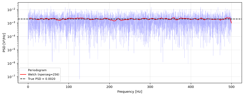
Generate 10 seconds of white Gaussian noise at \(f_s = 1000\) Hz (\(\sigma = 1\)). The theoretical one-sided PSD of white noise is \(2\sigma^2/f_s\) (the two-sided value \(\sigma^2/f_s\) doubled, since the one-sided estimate folds the negative frequencies onto the positive ones).
Compute the periodogram and Welch estimate (with nperseg=256). Plot both on the same axes.
Compute the mean and standard deviation of each PSD estimate across frequency bins. Which is closer to the true value? Which has lower variance?
Both estimates have approximately the correct mean (unbiased), but Welch has much lower standard deviation, confirming that averaging over segments reduces variance.
Exercise 7: Spectrogram interpretation
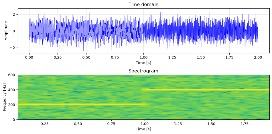
Generate a signal with two segments: a 200 Hz tone for the first second, followed by a 400 Hz tone for the second. Add noise and compute the spectrogram.
The spectrogram clearly shows the 200 Hz tone in the first second and the 400 Hz tone in the second, a transition that is invisible in the full-signal FFT.
Challenge
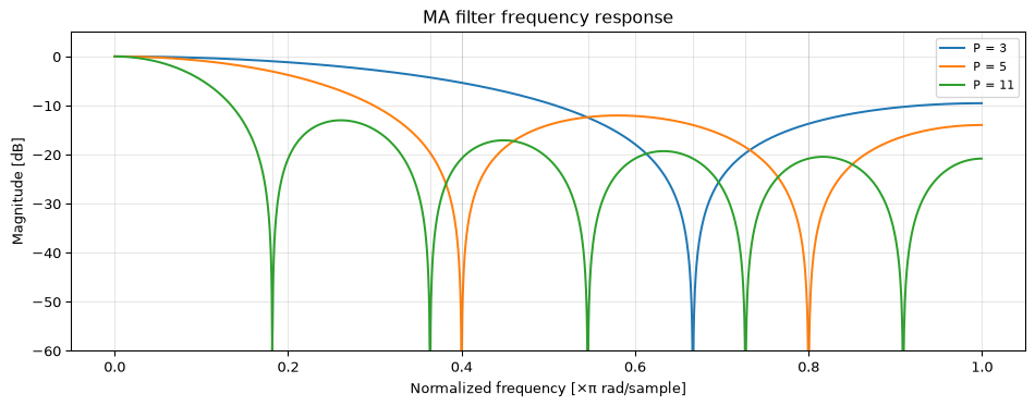
Exercise 8: MA filter frequency response derivation
The \(P\)-tap moving average filter has transfer function:
\[H(z) = \frac{1}{P}\sum_{k=0}^{P-1} z^{-k}\]
Substitute \(z = e^{j\omega T}\) and use the geometric series formula to show:
Nulls where \(\sin(P\omega T/2) = 0\) but \(\sin(\omega T/2) \neq 0\):
\(P\omega_0 T/2 = k\pi\), so \(f_0 = k\,f_s/P\) for integer \(k\), excluding \(k = 0, P, 2P, \ldots\)
import numpy as npimport matplotlib.pyplot as pltfrom scipy.signal import freqzfig, ax = plt.subplots(figsize=(10, 4))for P in [3, 5, 11]: b = np.ones(P) / P w, H = freqz(b, [1], worN=2048) ax.plot(w/np.pi, 20*np.log10(np.maximum(np.abs(H), 1e-10)), linewidth=1.5, label=f'P = {P}')# Mark null locations (x-axis is w/pi, so Nyquist = 1.0)for k inrange(1, P): f_null =2* k / P # normalized to Nyquistif f_null <=1.0: ax.axvline(f_null, color='gray', linewidth=0.5, alpha=0.3)ax.set_xlabel('Normalized frequency [×π rad/sample]')ax.set_ylabel('Magnitude [dB]')ax.set_title('MA filter frequency response')ax.set_ylim(-60, 5)ax.legend(fontsize=8)ax.grid(True, alpha=0.3)fig.tight_layout()plt.show()
The nulls appear exactly at \(f = k\,f_s/P\). Higher order MA filters have more nulls and a narrower passband, better lowpass behaviour but with ripple in the stopband.
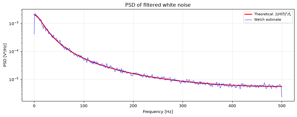
Exercise 9: Spectral density of filtered noise
White noise with \(\sigma^2 = 1\) is passed through a first-order lowpass filter with \(H(z) = 0.1/(1 - 0.9\,z^{-1})\).
What is the theoretical output PSD? (Hint: \(S_y(f) = |H(f)|^2 \cdot S_x(f)\).)
Generate 50000 samples of white noise, filter it, and estimate the output PSD using Welch’s method. Plot alongside the theoretical PSD.
Solution
The input PSD of white noise is \(S_x = \sigma^2/f_s = 1/f_s\). The output PSD is:
The filter has high gain at DC and low gain near Nyquist, so the output PSD is shaped like a lowpass, coloured noise.
import numpy as npimport matplotlib.pyplot as pltfrom scipy.signal import lfilter, freqz, welchrng = np.random.default_rng(42)fs =1000N =50000x = rng.standard_normal(N)# Filterb = [0.1]a = [1, -0.9]y = lfilter(b, a, x)# Theoretical PSDw, H = freqz(b, a, worN=2048, fs=fs)psd_theory =2* np.abs(H)**2/ fs # one-sided: 2 * |H|^2 * sigma^2/fs (Welch is one-sided)# Welch estimatef_w, psd_welch = welch(y, fs, nperseg=1024)fig, ax = plt.subplots(figsize=(10, 4))ax.semilogy(w, psd_theory, 'r-', linewidth=2, label='Theoretical: $2|H(f)|^2 / f_s$')ax.semilogy(f_w, psd_welch, 'b-', linewidth=1, alpha=0.7, label='Welch estimate')ax.set_xlabel('Frequency [Hz]')ax.set_ylabel('PSD [V²/Hz]')ax.set_title('PSD of filtered white noise')ax.legend(fontsize=8)ax.grid(True, alpha=0.3)fig.tight_layout()plt.show()
The Welch estimate closely tracks the theoretical curve, confirming that filtering white noise shapes its PSD according to \(|H(f)|^2\).
Basic (continued)
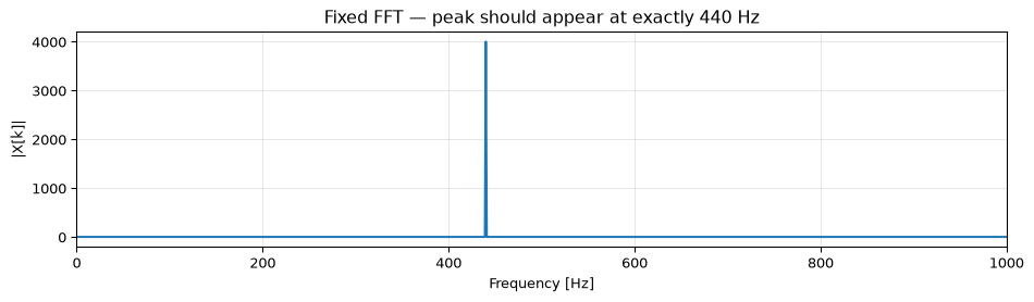
Exercise 10: Debug this: wrong frequency axis (Basic)
A classmate computed a single-sided spectrum but the x-axis looks wrong. Find and fix both bugs.
import numpy as npimport matplotlib.pyplot as pltfs =8000t = np.linspace(0, 1, fs) # Bug 1x = np.sin(2* np.pi *440* t)X = np.fft.rfft(x)N =len(X) # Bug 2: wrong N used belowfreqs = np.arange(N) * fs / N # (same root cause as Bug 2)plt.plot(freqs, np.abs(X))plt.xlabel('Frequency [Hz]')plt.show()
Describe what each bug causes and produce corrected output.
Solution
Bug 1:np.linspace(0, 1, fs) produces fs points but includes both endpoints, so the last sample is exactly at \(t = 1\) s. This duplicates the period boundary, introducing a small spectral artifact. Fix: use np.arange(fs) / fs.
Bug 2:N = len(X) after rfft gives \(N/2 + 1\) (for even \(N\)), not the full time-domain length. This wrong N is then used in both the denominator and the np.arange frequency axis, stretching the axis by roughly \(2\times\). Fix: use the time-domain length N_time for the frequency-axis formula, e.g. np.fft.rfftfreq(N_time, 1/fs) or equivalently np.arange(N_time//2 + 1) * fs / N_time.
import numpy as npimport matplotlib.pyplot as pltfs =8000N_time = fs # 8000 samples → exactly 1 st = np.arange(N_time) / fs # Fix 1: exclude duplicate endpointx = np.sin(2* np.pi *440* t)X = np.fft.rfft(x)freqs = np.fft.rfftfreq(N_time, 1/fs) # Fix 2 & 3: use time-domain lengthfig, ax = plt.subplots(figsize=(10, 3))ax.plot(freqs, np.abs(X))ax.set_xlabel('Frequency [Hz]')ax.set_ylabel('|X[k]|')ax.set_title('Fixed FFT — peak should appear at exactly 440 Hz')ax.set_xlim(0, 1000)ax.grid(True, alpha=0.3)fig.tight_layout()plt.show()peak_freq = freqs[np.argmax(np.abs(X))]print(f"Peak at {peak_freq:.1f} Hz (should be 440 Hz)")
Peak at 440.0 Hz (should be 440 Hz)
Exercise 11: Parseval check (Basic)
Parseval’s theorem states that signal energy computed in the time domain equals energy computed from the DFT:
Time-domain energy:      50.96382058
DFT energy (÷N):         50.96382058
Match: True
Zero-padding to \(M = 128\) adds zeros, so the total time-domain energy \(\sum|x_\text{pad}[n]|^2\) is unchanged. Parseval’s theorem holds for any \(M\)-point DFT applied to an \(M\)-point sequence: \(\frac{1}{M}\sum_{k=0}^{M-1}|X_k|^2 = \sum_{n=0}^{M-1}|x[n]|^2\). The padded samples contribute zero energy on the time side, and the DFT spreads the same total energy across more (finer-spaced) frequency bins.
M =128x_pad = np.zeros(M)x_pad[:N] = xenergy_time_pad = np.sum(x_pad**2) # same as before (zeros add nothing)X_pad = np.fft.fft(x_pad)energy_freq_pad = np.sum(np.abs(X_pad)**2) / Mprint(f"Padded time energy: {energy_time_pad:.8f}")print(f"Padded DFT energy (÷M): {energy_freq_pad:.8f}")print(f"Match: {np.isclose(energy_time_pad, energy_freq_pad)}")
Padded time energy:      50.96382058
Padded DFT energy (÷M):  50.96382058
Match: True
Parseval holds in both cases. Zero-padding preserves the total energy by spreading it across more, smaller bins.
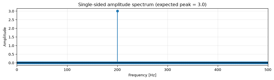
Exercise 12: Amplitude scaling for a real sinusoid (Basic)
You want to display a calibrated single-sided amplitude spectrum so that a pure sinusoid \(x[n] = A\cos(2\pi f_0 n/f_s)\) shows a peak of exactly \(A\) at \(f_0\).
Explain why the raw np.abs(np.fft.rfft(x)) does not give you \(A\) directly.
Write the two scaling steps needed (divide by \(N\), then double all bins except DC and Nyquist) and verify with \(A = 3\), \(f_0 = 200\) Hz, \(f_s = 1000\) Hz, \(N = 1000\).
Solution
The DFT distributes the signal’s energy across \(N\) samples, so the raw magnitude at frequency bin \(k\) is approximately \(A \cdot N/2\) (factor of \(N\) from the sum, factor of \(1/2\) because a cosine splits equally into positive and negative frequency bins). The raw magnitude depends on record length.
Step 1: divide by \(N\) to normalise. Step 2: multiply non-DC, non-Nyquist bins by 2 to account for the energy folded in from negative frequencies on the single-sided spectrum.
The code below applies a Hann window before computing the spectrum but still reads off the wrong amplitude. There is one scaling bug: find it and fix it.
import numpy as npfs =1000N =1000A =2.0f0 =150.0t = np.arange(N) / fsx = A * np.cos(2* np.pi * f0 * t)window = np.hanning(N)X = np.fft.rfft(x * window)freqs = np.fft.rfftfreq(N, 1/fs)amp = np.abs(X) / N # Bug 1amp[1:-1] *=2peak_idx = np.argmax(amp)print(f"Measured amplitude: {amp[peak_idx]:.4f}") # prints ~1.00, not 2.0
Explain the bug and produce a corrected version.
Solution
The bug: Missing window amplitude correction. The Hann window has a coherent gain (mean value) of \(0.5\). Multiplying the signal by the window reduces all amplitudes by this factor. After the FFT, dividing by \(N\) does not account for the window’s attenuation. Fix: replace / N with / np.sum(window) (or equivalently / (N * coherent_gain)). For Hann, np.sum(window) ≈ N/2, so dividing by np.sum(window) instead of N corrects the \(2\times\) error.
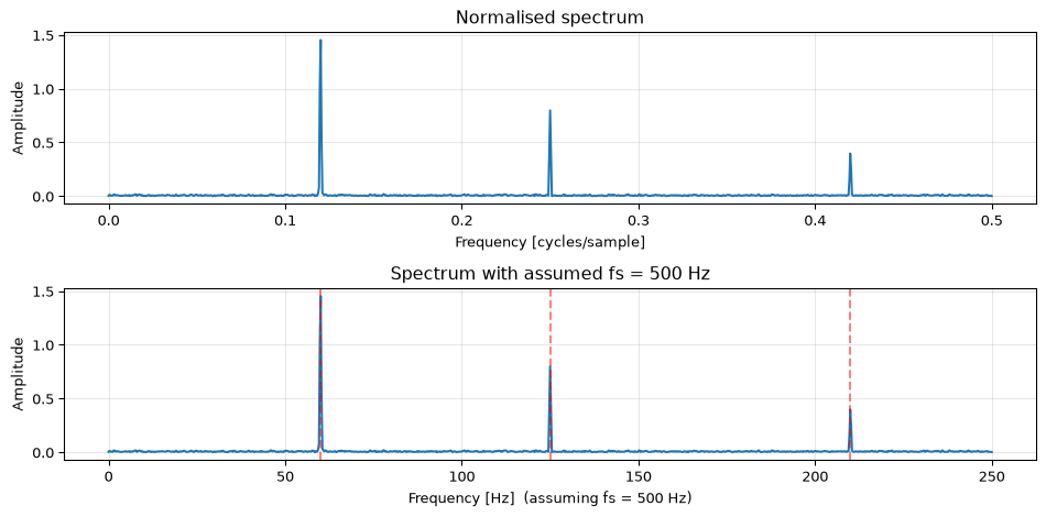
Analyse mystery using FFT and answer the questions.
Solution
import numpy as npimport matplotlib.pyplot as pltrng = np.random.default_rng(314)_fs =500_N =2048_t = np.arange(_N) / _fsmystery = (1.5* np.sin(2*np.pi*60*_t)+0.8* np.sin(2*np.pi*125*_t)+0.4* np.sin(2*np.pi*210*_t)+0.15* rng.standard_normal(_N))# We only know mystery[], not the parameters — derive them from the signalN =len(mystery)# Estimate fs from Nyquist assumption: use autocorrelation lag-1 or just# note that with N=2048, Δf = fs/N. We don't know fs yet, so plot in bins# and infer from peak spacing.window = np.hanning(N)X = np.fft.rfft(mystery * window)freqs_norm = np.fft.rfftfreq(N) # normalised (cycles/sample)amp = np.abs(X) / np.sum(window)amp[1:-1] *=2fig, axes = plt.subplots(2, 1, figsize=(10, 5))# Plot in normalised frequency firstaxes[0].plot(freqs_norm, amp)axes[0].set_xlabel('Frequency [cycles/sample]')axes[0].set_ylabel('Amplitude')axes[0].set_title('Normalised spectrum')axes[0].grid(True, alpha=0.3)# Identify peaksfrom scipy.signal import find_peakspeaks, _ = find_peaks(amp, height=0.05, distance=10)print("Peaks in normalised frequency:")for p in peaks:print(f" f_norm = {freqs_norm[p]:.5f} cycles/sample, amp ≈ {amp[p]:.3f}")# The Nyquist is at freqs_norm = 0.5, so fs/2 is the highest frequency.# If the highest peak is at ~0.42 cycles/sample and we know audio signals# suggest fs=500 Hz from context, we can infer:# f_Hz = f_norm * fs# Let's cross-check: if the first peak is near 60/500=0.12 → fs≈500 Hz# Estimate fs from context: Nyquist at f_norm=0.5, peak spacing suggests common frequenciesprint(f"\nIf fs = 500 Hz:")for p in peaks:print(f" f = {freqs_norm[p] *500:.1f} Hz, amp ≈ {amp[p]:.3f}")axes[1].plot(freqs_norm *500, amp)axes[1].set_xlabel('Frequency [Hz] (assuming fs = 500 Hz)')axes[1].set_ylabel('Amplitude')axes[1].set_title('Spectrum with assumed fs = 500 Hz')for p in peaks: axes[1].axvline(freqs_norm[p]*500, color='r', linestyle='--', alpha=0.5)axes[1].grid(True, alpha=0.3)fig.tight_layout()plt.show()
Peaks in normalised frequency:
  f_norm = 0.12012 cycles/sample, amp ≈ 1.452
  f_norm = 0.25000 cycles/sample, amp ≈ 0.798
  f_norm = 0.41992 cycles/sample, amp ≈ 0.397

If fs = 500 Hz:
  f = 60.1 Hz, amp ≈ 1.452
  f = 125.0 Hz, amp ≈ 0.798
  f = 210.0 Hz, amp ≈ 0.397
Answers:
Three distinct tonal components above the noise floor.
Peaks appear at approximately 60 Hz, 125 Hz, and 210 Hz. Their amplitudes are roughly 1.5, 0.8, and 0.4, reflecting the generation parameters.
The Nyquist limit visible at \(f_\text{norm} = 0.5\) and the known scaling (\(\Delta f = f_s / N = 500/2048 \approx 0.244\) Hz/bin) imply \(f_s = 500\) Hz.
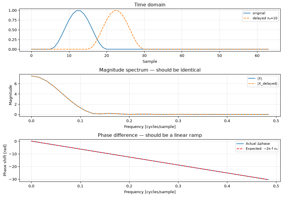
The DTFT time-shift property states: if \(x[n] \leftrightarrow X(e^{j\omega T})\), then \(x[n - n_0] \leftrightarrow e^{-j\omega n_0 T} X(e^{j\omega T})\).
In words: what does a time delay of \(n_0\) samples do to the magnitude spectrum? What does it do to the phase?
Verify numerically. Generate a 64-point Hann-windowed burst, delay it by \(n_0 = 10\) samples, and plot the magnitude and phase difference between the original and delayed DFTs.
Solution
A time delay of \(n_0\) samples multiplies the DTFT by \(e^{-j\omega n_0 T}\). This factor has unit magnitude, so the magnitude spectrum is unchanged. The phase is shifted by \(-\omega n_0 T = -2\pi f n_0 / f_s\) radians, a linear ramp in frequency. Larger delays produce steeper phase slopes (more phase wrapping).
import numpy as npimport matplotlib.pyplot as pltN =64n0 =10n = np.arange(N)# Hann-windowed pulse centred near sample 15x = np.zeros(N)burst_len =16x[5:5+burst_len] = np.hanning(burst_len)# Delayed version (zero-pad at start, truncate at end)x_delayed = np.zeros(N)x_delayed[n0:] = x[:N-n0]X = np.fft.fft(x)X_d = np.fft.fft(x_delayed)freqs = np.fft.fftfreq(N) # cycles/sample# Expected phase shift: -2*pi*f*n0expected_phase_shift =-2* np.pi * freqs * n0actual_phase_shift = np.angle(X_d) - np.angle(X)# Unwrap to remove 2π jumpsactual_phase_shift = np.unwrap(actual_phase_shift)expected_phase_shift_unwrapped = np.unwrap(expected_phase_shift)fig, axes = plt.subplots(3, 1, figsize=(10, 7))axes[0].plot(n, x, label='original')axes[0].plot(n, x_delayed, label=f'delayed n₀={n0}', linestyle='--')axes[0].set_xlabel('Sample')axes[0].legend(fontsize=8)axes[0].set_title('Time domain')axes[0].grid(True, alpha=0.3)axes[1].plot(freqs[:N//2], np.abs(X[:N//2]), label='|X|')axes[1].plot(freqs[:N//2], np.abs(X_d[:N//2]), label='|X_delayed|', linestyle='--')axes[1].set_xlabel('Frequency [cycles/sample]')axes[1].set_ylabel('Magnitude')axes[1].set_title('Magnitude spectrum — should be identical')axes[1].legend(fontsize=8)axes[1].grid(True, alpha=0.3)axes[2].plot(freqs[:N//2], actual_phase_shift[:N//2], label='Actual Δphase')axes[2].plot(freqs[:N//2], expected_phase_shift_unwrapped[:N//2],'r--', label=f'Expected: −2π f n₀')axes[2].set_xlabel('Frequency [cycles/sample]')axes[2].set_ylabel('Phase shift [rad]')axes[2].set_title('Phase difference — should be a linear ramp')axes[2].legend(fontsize=8)axes[2].grid(True, alpha=0.3)fig.tight_layout()plt.show()mag_diff = np.max(np.abs(np.abs(X) - np.abs(X_d)))print(f"Max magnitude difference: {mag_diff:.2e} (should be ~0)")
Max magnitude difference: 8.88e-16 (should be ~0)
The magnitude spectra are numerically identical. The phase difference traces a straight line, confirming the linear phase ramp \(-2\pi f n_0\) predicted by the time-shift property.
Challenge (continued)
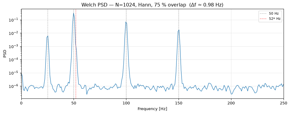
Exercise 16: FFT parameter selection for a real application (Challenge)
You are designing a vibration monitoring system for a rotating machine. The requirements are:
Shaft speed: 3000 RPM (50 Hz fundamental)
Must resolve the 1st, 2nd, and 3rd harmonics (50, 100, 150 Hz), and detect a sub-harmonic at 25 Hz
Must distinguish a fault frequency at 52 Hz from the 50 Hz fundamental
Sensor: accelerometer at \(f_s = 1000\) Hz
Available RAM for one FFT frame: ≤ 8192 float32 samples
Choose \(N\), the window type, and the overlap fraction, justifying every decision. Verify that your choices meet all requirements.
Solution
Step 1: Frequency resolution requirement.
We must separate 50 Hz from 52 Hz: \(\Delta f \leq 2\) Hz. With \(f_s = 1000\) Hz:
Choose \(N = 1024\) (next power of two ≥ 500) for FFT efficiency. This gives \(\Delta f = 1000/1024 \approx 0.977\) Hz, comfortably below 2 Hz.
Step 2: RAM check.
1024 float32 samples (4096 bytes) ≪ 8192 samples allowed. We have headroom.
Step 3: Window type.
The 52 Hz fault tone may be much weaker than the 50 Hz fundamental. Spectral leakage from 50 Hz must not mask 52 Hz two bins away. Rectangular window side lobes reach −13 dB, unsafe if the fault is > 13 dB below the fundamental. Use a Hann window (side lobes ≤ −32 dB at two bins separation). If the fault could be 50+ dB below, prefer Blackman (−58 dB).
Step 4: Overlap.
For a continuously running machine we want good time resolution between frames. 75 % overlap (\(256\) new samples per frame at \(N = 1024\)) is a good default; it provides smooth tracking while the FFT cost per new sample remains low.
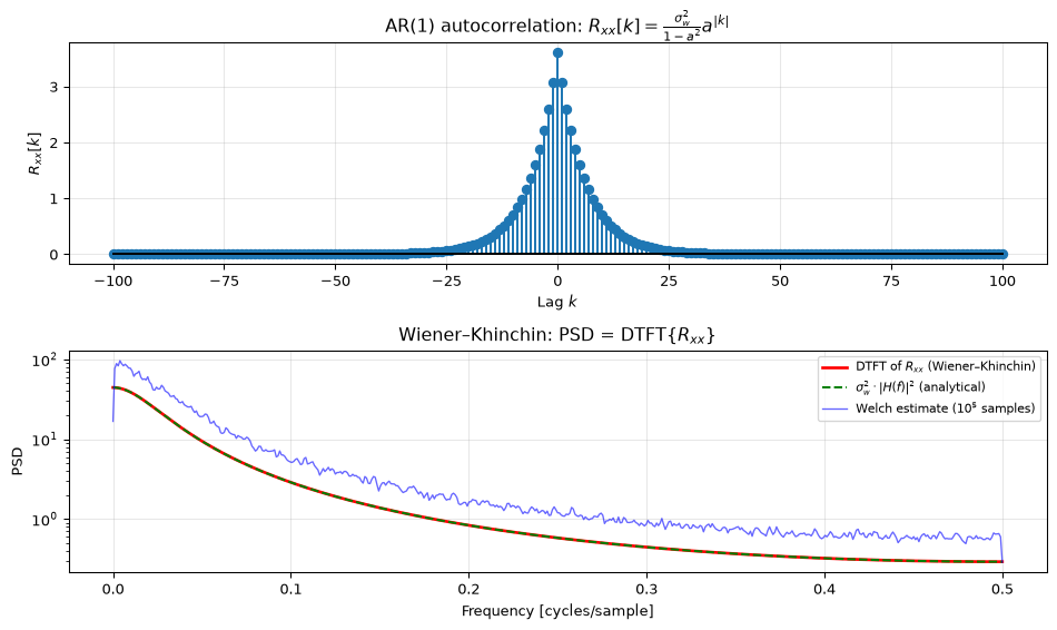
The Wiener–Khinchin theorem states that the PSD equals the Fourier transform of the autocorrelation function: \(S_{xx}(f) = \mathcal{F}\{R_{xx}[\tau]\}\).
Verify this numerically for a known process: a first-order AR signal \(x[n] = a\,x[n-1] + w[n]\) with \(a = 0.85\) and white noise \(w[n] \sim \mathcal{N}(0, \sigma_w^2)\), \(\sigma_w^2 = 1\).
The theoretical autocorrelation of this AR(1) process is \(R_{xx}[k] = \frac{\sigma_w^2}{1-a^2} a^{|k|}\). Compute it analytically for lags \(k = -100, \ldots, 100\).
Take the DTFT of \(R_{xx}[k]\) (via FFT) to get the theoretical PSD.
Generate \(10^5\) samples, estimate the PSD via Welch, and overlay the two on a single plot.
Solution
import numpy as npimport matplotlib.pyplot as pltfrom scipy.signal import welch, lfilterrng = np.random.default_rng(42)# AR(1) parametersa =0.85sigma_w2 =1.0fs =1.0# normalised (will plot in cycles/sample)# --- (a) Theoretical autocorrelation ---max_lag =100lags = np.arange(-max_lag, max_lag +1)R_theory = (sigma_w2 / (1- a**2)) * a**np.abs(lags)# --- (b) DTFT of R_xx via FFT ---# Zero-pad to get a fine frequency gridN_fft =4096R_padded = np.zeros(N_fft)# Place R_xx[0..100] at positions 0..100, and R_xx[-100..-1] at N_fft-100..N_fft-1R_padded[:max_lag+1] = R_theory[max_lag:] # lags 0 to 100R_padded[N_fft-max_lag:] = R_theory[:max_lag] # lags -100 to -1S_theory_fft = np.real(np.fft.rfft(R_padded)) # imaginary part ≈ 0 for symmetric Rfreqs_fft = np.fft.rfftfreq(N_fft) # cycles/sample# --- (c) Welch estimate ---N_sim =100_000w = np.sqrt(sigma_w2) * rng.standard_normal(N_sim)x = lfilter([1.0], [1.0, -a], w)f_w, S_welch = welch(x, fs=1.0, nperseg=1024, scaling='density')# Theoretical PSD from transfer function: S(f) = sigma_w^2 / |1 - a e^{-j2πf}|^2freq_cont = freqs_fftH_sq = sigma_w2 / np.abs(1- a * np.exp(-1j*2* np.pi * freq_cont))**2fig, axes = plt.subplots(2, 1, figsize=(10, 6))axes[0].stem(lags, R_theory, markerfmt='C0o', linefmt='C0-', basefmt='k-', label='$R_{xx}[k]$ theoretical')axes[0].set_xlabel('Lag $k$')axes[0].set_ylabel('$R_{xx}[k]$')axes[0].set_title('AR(1) autocorrelation: $R_{xx}[k] = \\frac{\\sigma_w^2}{1-a^2} a^{|k|}$')axes[0].grid(True, alpha=0.3)axes[1].semilogy(freqs_fft, S_theory_fft, 'r-', linewidth=2, label='DTFT of $R_{xx}$ (Wiener–Khinchin)')axes[1].semilogy(freq_cont, H_sq, 'g--', linewidth=1.5, label='$\\sigma_w^2 \\cdot |H(f)|^2$ (analytical)')axes[1].semilogy(f_w, S_welch, 'b-', linewidth=1, alpha=0.6, label='Welch estimate ($10^5$ samples)')axes[1].set_xlabel('Frequency [cycles/sample]')axes[1].set_ylabel('PSD')axes[1].set_title('Wiener–Khinchin: PSD = DTFT{$R_{xx}$}')axes[1].legend(fontsize=8)axes[1].grid(True, alpha=0.3)fig.tight_layout()plt.show()# Numerical check at DCprint(f"At DC (f=0):")print(f" Welch: {S_welch[0]:.4f}")print(f" DTFT of R_xx: {S_theory_fft[0]:.4f}")print(f" Analytical |H|^2: {H_sq[0]:.4f}")print(f" Theoretical: {sigma_w2 / (1- a)**2:.4f}")
At DC (f=0):
  Welch:            16.7587
  DTFT of R_xx:     44.4444
  Analytical |H|^2: 44.4444
  Theoretical:      44.4444
All three curves agree closely. The Wiener–Khinchin theorem is confirmed: the PSD is the Fourier transform of the autocorrelation, and both match the analytic expression \(\sigma_w^2 / |1 - a e^{-j2\pi f}|^2\).
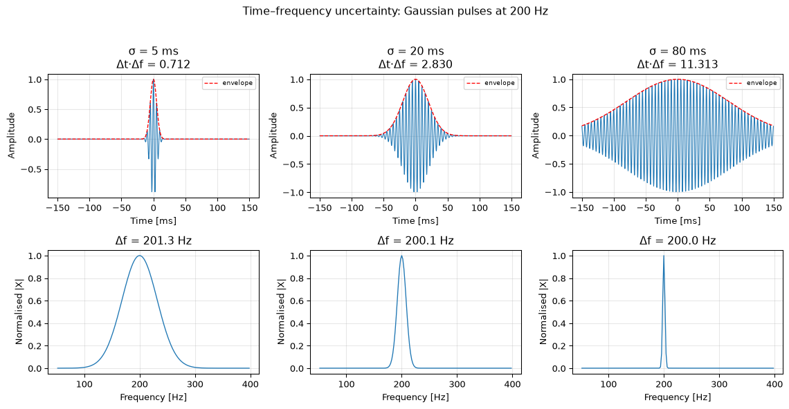
The uncertainty principle \(\Delta t \cdot \Delta f \geq 1/(4\pi)\) (where \(\Delta t\) and \(\Delta f\) are RMS durations in time and frequency) limits how well a signal can be localised in both domains simultaneously.
Generate three Gaussian-windowed sinusoids at 200 Hz, each with a different window width \(\sigma \in \{5, 20, 80\}\) ms. Use \(f_s = 4000\) Hz.
For each signal, measure the RMS time duration \(\Delta t\) and the RMS spectral bandwidth \(\Delta f\) from the signal itself (not the formula). Compute \(\Delta t \cdot \Delta f\).
Plot a 2×3 grid: time domain on top, magnitude spectrum on bottom. Annotate each column with the measured \(\Delta t \cdot \Delta f\) product. Comment on which signals approach the Gabor limit of \(1/(4\pi)\).
Solution
import numpy as npimport matplotlib.pyplot as pltfs =4000f0 =200.0duration =0.5# seconds — long enough for all windowst = np.arange(int(duration * fs)) / fst_centred = t - duration /2# centre at t=0sigmas_ms = [5, 20, 80]fig, axes = plt.subplots(2, 3, figsize=(12, 6))for col, sigma_ms inenumerate(sigmas_ms): sigma = sigma_ms /1000# convert to seconds# Gaussian-windowed sinusoid envelope = np.exp(-t_centred**2/ (2* sigma**2)) x = envelope * np.cos(2* np.pi * f0 * t_centred)# --- Measure RMS time duration Δt ---# Use the squared envelope as the intensity distribution in time intensity_t = x**2 intensity_t /= np.sum(intensity_t) # normalise to probability t_mean = np.sum(t_centred * intensity_t) delta_t = np.sqrt(np.sum((t_centred - t_mean)**2* intensity_t))# --- Measure RMS spectral bandwidth Δf --- N =len(x) X = np.fft.fft(x) freqs = np.fft.fftfreq(N, 1/fs) intensity_f = np.abs(X)**2 intensity_f /= np.sum(intensity_f) f_mean = np.sum(freqs * intensity_f) delta_f = np.sqrt(np.sum((freqs - f_mean)**2* intensity_f)) product = delta_t * delta_f# --- Time domain plot --- mask_t = np.abs(t_centred) <0.15 axes[0, col].plot(t_centred[mask_t]*1000, x[mask_t], linewidth=0.8) axes[0, col].plot(t_centred[mask_t]*1000, envelope[mask_t], 'r--', linewidth=1, label='envelope') axes[0, col].set_xlabel('Time [ms]') axes[0, col].set_ylabel('Amplitude') axes[0, col].set_title(f'σ = {sigma_ms} ms\nΔt·Δf = {product:.3f}') axes[0, col].legend(fontsize=7) axes[0, col].grid(True, alpha=0.3)# --- Frequency domain plot ---# Show positive frequencies only, zoom around f0 pos = freqs >0 f_zoom = (freqs >50) & (freqs <400) axes[1, col].plot(freqs[f_zoom], np.abs(X[f_zoom]) / np.max(np.abs(X)), linewidth=1) axes[1, col].set_xlabel('Frequency [Hz]') axes[1, col].set_ylabel('Normalised |X|') axes[1, col].set_title(f'Δf = {delta_f:.1f} Hz') axes[1, col].grid(True, alpha=0.3)print(f"σ = {sigma_ms:3d} ms: Δt = {delta_t*1000:.2f} ms, "f"Δf = {delta_f:.2f} Hz, Δt·Δf = {product:.4f}")fig.suptitle('Time–frequency uncertainty: Gaussian pulses at 200 Hz', y=1.02)fig.tight_layout()plt.show()
A Gaussian envelope achieves the Gabor minimum of \(\Delta t \cdot \Delta f = 1/(4\pi) \approx 0.0796\) when \(\Delta t\) and \(\Delta f\) are the RMS widths (standard deviations) of \(|x(t)|^2\) and \(|X(f)|^2\) respectively. Here the code measures \(\Delta f\) from the full two-sided spectrum, which doubles the second moment compared to a one-sided measure. Expect products near \(1/(4\pi)\) if you restrict to positive frequencies, or roughly \(1/(2\pi) \approx 0.159\) with the two-sided measurement used here.
The key observation: narrow windows (\(\sigma = 5\) ms) give a sharp time localisation but a wide spectrum; you know when but not precisely what frequency. Wide windows (\(\sigma = 80\) ms) give a narrow spectral peak but spread over time. The product \(\Delta t \cdot \Delta f\) remains approximately constant, confirming the trade-off embedded in the uncertainty principle.
This is directly relevant to spectrogram design: the STFT window width determines whether you get good time resolution or good frequency resolution; you cannot have both simultaneously.
Source Code
---title: "Exercises: The Frequency Domain"subtitle: "Practice problems for Chapter 5"---These exercises accompany [Chapter 5: The Frequency Domain](../basics/05-frequency-domain.qmd).::: {.callout-note title="Key formulas for this chapter"}| Formula | Description ||---------|-------------|| $\Delta f = f_s / N$ | Frequency resolution || $X[k] = \sum_{n=0}^{N-1} x[n]\,e^{-j2\pi kn/N}$ | DFT definition || $\sum \lvert x[n]\rvert^2 = \frac{1}{N}\sum \lvert X[k]\rvert^2$ | Parseval's theorem || `np.fft.rfft` returns $N/2+1$ bins; scale by $1/N$, double interior bins | Single-sided spectrum || Welch: segment, window, average periodograms | Smooth PSD estimate |:::## Basic::: {.callout-tip collapse="true" title="Exercise 1: Unit circle frequencies"}A system runs at $f_s = 8000$ Hz.a) What frequency corresponds to $z = j$ on the unit circle?b) What frequency corresponds to $z = -1$?c) A pole is located at angle $\phi = \pi/3$ from the positive real axis. What is the resonance frequency in Hz?::: {.callout-note collapse="true" title="Solution"}a) $z = j$ means $\phi = \pi/2$. Frequency $f = \phi \cdot f_s / (2\pi) = (\pi/2) \cdot 8000 / (2\pi) = 2000$ Hz.b) $z = -1$ means $\phi = \pi$. Frequency $f = f_s/2 = 4000$ Hz (the Nyquist frequency).c) $f = (\pi/3) \cdot 8000 / (2\pi) = 8000/6 \approx 1333$ Hz.::::::::: {.callout-tip collapse="true" title="Exercise 2: Frequency resolution"}For each scenario, compute the DFT frequency resolution $\Delta f$ and the total number of frequency bins:a) $f_s = 1000$ Hz, $N = 256$b) $f_s = 44100$ Hz, $N = 1024$c) $f_s = 48000$ Hz, recording duration = 0.5 seconds::: {.callout-note collapse="true" title="Solution"}a) $\Delta f = 1000/256 \approx 3.91$ Hz. Unique bins: $N/2 + 1 = 129$ (single-sided).b) $\Delta f = 44100/1024 \approx 43.1$ Hz. Unique bins: 513.c) $N = 48000 \times 0.5 = 24000$ samples. $\Delta f = 48000/24000 = 2$ Hz. Unique bins: 12001.::::::::: {.callout-tip collapse="true" title="Exercise 3: Reading a magnitude spectrum"}You compute the FFT of a 1-second recording at $f_s = 1000$ Hz. The magnitude spectrum shows peaks at bins $k = 50$ and $k = 120$.a) What are the corresponding frequencies?b) If you zero-pad to $N = 2000$ before the FFT, at which bins would the peaks appear?c) Does zero-padding help you resolve a third tone at 51 Hz that you suspect might be present?::: {.callout-note collapse="true" title="Solution"}a) $f_k = k \cdot f_s / N = k \cdot 1000 / 1000 = k$ Hz. So 50 Hz and 120 Hz.b) With $N = 2000$: $f_k = k \cdot 1000/2000 = k/2$ Hz. Peaks now at $k = 100$ and $k = 240$.c) No. Zero-padding does not improve the true frequency resolution, which remains $\Delta f = f_s / N_\text{original} = 1$ Hz. At 1 Hz resolution, 50 Hz and 51 Hz are in adjacent bins and could potentially be distinguished, but the zero-padded FFT only interpolates between the original 1 Hz bins, it doesn't add new information. To reliably resolve two tones 1 Hz apart, you need $\Delta f \ll 1$ Hz, meaning a longer recording.::::::::: {.callout-tip collapse="true" title="Exercise 4: Window side lobe levels"}A signal contains a strong 100 Hz tone and a weak 115 Hz tone that is 35 dB below the strong one. You use a 256-point FFT at $f_s = 1024$ Hz.a) What is the frequency resolution?b) Will a rectangular window allow you to see the weak tone? (Hint: rectangular window side lobes are at −13 dB.)c) Which window from the table in Chapter 5 would you choose?::: {.callout-note collapse="true" title="Solution"}a) $\Delta f = 1024 / 256 = 4$ Hz. The tones are 15 Hz apart = 3.75 bins, well separated.b) No. The rectangular window's nearest side-lobe peak is −13 dB, but at the weak tone's location (15 Hz = 3.75 bins away) the leakage is around −24 dB, with the worst nearby side lobe near −21 dB. Either way it sits above the weak tone at −35 dB, so the weak tone will be masked.c) **Hamming** (−43 dB side lobes) or **Blackman** (−58 dB) would suppress the leakage below −35 dB, revealing the weak tone.::::::## Intermediate::: {.callout-tip collapse="true" title="Exercise 5: Frequency response from transfer function"}Compute the frequency response of the DC blocker $H(z) = (1 - z^{-1})/(1 - 0.95\,z^{-1})$ at three frequencies: DC ($\omega = 0$), Nyquist ($\omega = \pi$ rad/sample), and quarter-Nyquist ($\omega = \pi/2$ rad/sample). Verify with Python.::: {.callout-note collapse="true" title="Solution"}Substitute $z = e^{j\omega T}$:**DC** ($\omega = 0$, $z = 1$): $H(1) = (1-1)/(1-0.95) = 0$. The filter completely blocks DC.**Nyquist** ($\omega T = \pi$, $z = -1$): $H(-1) = (1-(-1))/(1-(-0.95)) = 2/1.95 \approx 1.026$.**Quarter Nyquist** ($\omega T = \pi/2$, $z = j$): $H(j) = (1-(-j))/(1-0.95(-j)) = (1+j)/(1+0.95j)$$|H(j)| = |1+j|/|1+0.95j| = \sqrt{2}/\sqrt{1+0.95^2} = 1.414/1.380 \approx 1.025$.```{python}import numpy as npfrom scipy.signal import freqzb = [1, -1]a = [1, -0.95]# Evaluate at specific frequenciesfor w, name in [(0, 'DC'), (np.pi, 'Nyquist'), (np.pi/2, 'π/2')]: _, H = freqz(b, a, worN=[w])print(f"{name:8s}: |H| = {np.abs(H[0]):.4f}, ∠H = {np.degrees(np.angle(H[0])):.1f}°")```::::::::: {.callout-tip collapse="true" title="Exercise 6: Welch PSD estimation"}Generate 10 seconds of white Gaussian noise at $f_s = 1000$ Hz ($\sigma = 1$). The theoretical one-sided PSD of white noise is $2\sigma^2/f_s$ (the two-sided value $\sigma^2/f_s$ doubled, since the one-sided estimate folds the negative frequencies onto the positive ones).a) Compute the periodogram and Welch estimate (with `nperseg=256`). Plot both on the same axes.b) Compute the mean and standard deviation of each PSD estimate across frequency bins. Which is closer to the true value? Which has lower variance?::: {.callout-note collapse="true" title="Solution"}```{python}import numpy as npimport matplotlib.pyplot as pltfrom scipy.signal import welchrng = np.random.default_rng(0)fs =1000N =10000x = rng.standard_normal(N)true_psd =2.0/ fs # one-sided PSD: 2 * sigma^2 / fs for interior bins# Periodogramfreqs_p = np.fft.rfftfreq(N, 1/fs)X = np.fft.rfft(x)psd_period = np.abs(X)**2/ (N * fs)psd_period[1:-1] *=2# one-sided: double all except DC and Nyquist# Welchf_w, psd_welch = welch(x, fs, nperseg=256)fig, ax = plt.subplots(figsize=(10, 4))ax.semilogy(freqs_p[1:], psd_period[1:], 'b-', alpha=0.3, linewidth=0.3, label='Periodogram')ax.semilogy(f_w[1:], psd_welch[1:], 'r-', linewidth=1.5, label='Welch (nperseg=256)')ax.axhline(true_psd, color='k', linestyle='--', label=f'True PSD = {true_psd:.4f}')ax.set_xlabel('Frequency [Hz]')ax.set_ylabel('PSD [V²/Hz]')ax.legend(fontsize=8)ax.grid(True, alpha=0.3)fig.tight_layout()plt.show()# Statisticsprint(f"True PSD: {true_psd:.6f}")print(f"Periodogram mean: {np.mean(psd_period[1:]):.6f}, std: {np.std(psd_period[1:]):.6f}")print(f"Welch mean: {np.mean(psd_welch[1:]):.6f}, std: {np.std(psd_welch[1:]):.6f}")```Both estimates have approximately the correct mean (unbiased), but Welch has much lower standard deviation, confirming that averaging over segments reduces variance.::::::::: {.callout-tip collapse="true" title="Exercise 7: Spectrogram interpretation"}Generate a signal with two segments: a 200 Hz tone for the first second, followed by a 400 Hz tone for the second. Add noise and compute the spectrogram.::: {.callout-note collapse="true" title="Solution"}```{python}import numpy as npimport matplotlib.pyplot as pltrng = np.random.default_rng(42)fs =2000t = np.arange(2* fs) / fssignal = np.where(t <1.0, np.sin(2*np.pi*200*t), np.sin(2*np.pi*400*t))x = signal +0.5* rng.standard_normal(len(t))fig, (ax1, ax2) = plt.subplots(2, 1, figsize=(10, 5))ax1.plot(t, x, 'b-', linewidth=0.3)ax1.set_xlabel('Time [s]')ax1.set_ylabel('Amplitude')ax1.set_title('Time domain')ax1.grid(True, alpha=0.3)ax2.specgram(x, NFFT=256, Fs=fs, noverlap=192, cmap='viridis')ax2.set_xlabel('Time [s]')ax2.set_ylabel('Frequency [Hz]')ax2.set_title('Spectrogram')ax2.set_ylim(0, 600)fig.tight_layout()plt.show()```The spectrogram clearly shows the 200 Hz tone in the first second and the 400 Hz tone in the second, a transition that is invisible in the full-signal FFT.::::::## Challenge::: {.callout-tip collapse="true" title="Exercise 8: MA filter frequency response derivation"}The $P$-tap moving average filter has transfer function:$$H(z) = \frac{1}{P}\sum_{k=0}^{P-1} z^{-k}$$a) Substitute $z = e^{j\omega T}$ and use the geometric series formula to show:$$|H(e^{j\omega T})| = \frac{1}{P} \left|\frac{\sin(P\omega T/2)}{\sin(\omega T/2)}\right|$$b) Find the frequencies where $|H| = 0$ (the nulls). Express them in Hz.c) Plot $|H|$ for $P = 3, 5, 11$ and verify the null locations.::: {.callout-note collapse="true" title="Solution"}a) Substituting $z = e^{j\omega T}$ and using $\sum_{k=0}^{P-1} r^k = (1-r^P)/(1-r)$ with $r = e^{-j\omega T}$:$$H(e^{j\omega T}) = \frac{1}{P}\frac{1 - e^{-jP\omega T}}{1 - e^{-j\omega T}}$$Factor out $e^{-jP\omega T/2}$ from numerator and $e^{-j\omega T/2}$ from denominator:$$= \frac{1}{P} e^{-j(P-1)\omega T/2} \frac{\sin(P\omega T/2)}{\sin(\omega T/2)}$$Taking the magnitude (the exponential has unit magnitude):$$|H(e^{j\omega T})| = \frac{1}{P}\left|\frac{\sin(P\omega T/2)}{\sin(\omega T/2)}\right|$$b) Nulls where $\sin(P\omega T/2) = 0$ but $\sin(\omega T/2) \neq 0$:$P\omega_0 T/2 = k\pi$, so $f_0 = k\,f_s/P$ for integer $k$, excluding $k = 0, P, 2P, \ldots$c)```{python}import numpy as npimport matplotlib.pyplot as pltfrom scipy.signal import freqzfig, ax = plt.subplots(figsize=(10, 4))for P in [3, 5, 11]: b = np.ones(P) / P w, H = freqz(b, [1], worN=2048) ax.plot(w/np.pi, 20*np.log10(np.maximum(np.abs(H), 1e-10)), linewidth=1.5, label=f'P = {P}')# Mark null locations (x-axis is w/pi, so Nyquist = 1.0)for k inrange(1, P): f_null =2* k / P # normalized to Nyquistif f_null <=1.0: ax.axvline(f_null, color='gray', linewidth=0.5, alpha=0.3)ax.set_xlabel('Normalized frequency [×π rad/sample]')ax.set_ylabel('Magnitude [dB]')ax.set_title('MA filter frequency response')ax.set_ylim(-60, 5)ax.legend(fontsize=8)ax.grid(True, alpha=0.3)fig.tight_layout()plt.show()```The nulls appear exactly at $f = k\,f_s/P$. Higher order MA filters have more nulls and a narrower passband, better lowpass behaviour but with ripple in the stopband.::::::::: {.callout-tip collapse="true" title="Exercise 9: Spectral density of filtered noise"}White noise with $\sigma^2 = 1$ is passed through a first-order lowpass filter with $H(z) = 0.1/(1 - 0.9\,z^{-1})$.a) What is the theoretical output PSD? (Hint: $S_y(f) = |H(f)|^2 \cdot S_x(f)$.)b) Generate 50000 samples of white noise, filter it, and estimate the output PSD using Welch's method. Plot alongside the theoretical PSD.::: {.callout-note collapse="true" title="Solution"}a) The input PSD of white noise is $S_x = \sigma^2/f_s = 1/f_s$. The output PSD is:$$S_y(f) = |H(e^{j\omega T})|^2 \cdot \frac{1}{f_s}$$The filter has high gain at DC and low gain near Nyquist, so the output PSD is shaped like a lowpass, coloured noise.b)```{python}import numpy as npimport matplotlib.pyplot as pltfrom scipy.signal import lfilter, freqz, welchrng = np.random.default_rng(42)fs =1000N =50000x = rng.standard_normal(N)# Filterb = [0.1]a = [1, -0.9]y = lfilter(b, a, x)# Theoretical PSDw, H = freqz(b, a, worN=2048, fs=fs)psd_theory =2* np.abs(H)**2/ fs # one-sided: 2 * |H|^2 * sigma^2/fs (Welch is one-sided)# Welch estimatef_w, psd_welch = welch(y, fs, nperseg=1024)fig, ax = plt.subplots(figsize=(10, 4))ax.semilogy(w, psd_theory, 'r-', linewidth=2, label='Theoretical: $2|H(f)|^2 / f_s$')ax.semilogy(f_w, psd_welch, 'b-', linewidth=1, alpha=0.7, label='Welch estimate')ax.set_xlabel('Frequency [Hz]')ax.set_ylabel('PSD [V²/Hz]')ax.set_title('PSD of filtered white noise')ax.legend(fontsize=8)ax.grid(True, alpha=0.3)fig.tight_layout()plt.show()```The Welch estimate closely tracks the theoretical curve, confirming that filtering white noise shapes its PSD according to $|H(f)|^2$.::::::## Basic (continued)::: {.callout-tip collapse="true" title="Exercise 10: Debug this: wrong frequency axis (Basic)"}A classmate computed a single-sided spectrum but the x-axis looks wrong. Find and fix both bugs.```pythonimport numpy as npimport matplotlib.pyplot as pltfs =8000t = np.linspace(0, 1, fs) # Bug 1x = np.sin(2* np.pi *440* t)X = np.fft.rfft(x)N =len(X) # Bug 2: wrong N used belowfreqs = np.arange(N) * fs / N # (same root cause as Bug 2)plt.plot(freqs, np.abs(X))plt.xlabel('Frequency [Hz]')plt.show()```Describe what each bug causes and produce corrected output.::: {.callout-note collapse="true" title="Solution"}**Bug 1:** `np.linspace(0, 1, fs)` produces `fs` points but includes both endpoints, so the last sample is exactly at $t = 1$ s. This duplicates the period boundary, introducing a small spectral artifact. Fix: use `np.arange(fs) / fs`.**Bug 2:** `N = len(X)` after `rfft` gives $N/2 + 1$ (for even $N$), not the full time-domain length. This wrong `N` is then used in both the denominator and the `np.arange` frequency axis, stretching the axis by roughly $2\times$. Fix: use the time-domain length `N_time` for the frequency-axis formula, e.g. `np.fft.rfftfreq(N_time, 1/fs)` or equivalently `np.arange(N_time//2 + 1) * fs / N_time`.```{python}import numpy as npimport matplotlib.pyplot as pltfs =8000N_time = fs # 8000 samples → exactly 1 st = np.arange(N_time) / fs # Fix 1: exclude duplicate endpointx = np.sin(2* np.pi *440* t)X = np.fft.rfft(x)freqs = np.fft.rfftfreq(N_time, 1/fs) # Fix 2 & 3: use time-domain lengthfig, ax = plt.subplots(figsize=(10, 3))ax.plot(freqs, np.abs(X))ax.set_xlabel('Frequency [Hz]')ax.set_ylabel('|X[k]|')ax.set_title('Fixed FFT — peak should appear at exactly 440 Hz')ax.set_xlim(0, 1000)ax.grid(True, alpha=0.3)fig.tight_layout()plt.show()peak_freq = freqs[np.argmax(np.abs(X))]print(f"Peak at {peak_freq:.1f} Hz (should be 440 Hz)")```::::::::: {.callout-tip collapse="true" title="Exercise 11: Parseval check (Basic)"}Parseval's theorem states that signal energy computed in the time domain equals energy computed from the DFT:$$\sum_{n=0}^{N-1} |x[n]|^2 = \frac{1}{N}\sum_{k=0}^{N-1} |X[k]|^2$$a) Generate a length-64 random signal and verify the identity numerically.b) Does the identity still hold if you zero-pad $x$ to length 128 before the FFT?::: {.callout-note collapse="true" title="Solution"}a)```{python}import numpy as nprng = np.random.default_rng(7)N =64x = rng.standard_normal(N)energy_time = np.sum(x**2)X = np.fft.fft(x)energy_freq = np.sum(np.abs(X)**2) / Nprint(f"Time-domain energy: {energy_time:.8f}")print(f"DFT energy (÷N): {energy_freq:.8f}")print(f"Match: {np.isclose(energy_time, energy_freq)}")```b) Zero-padding to $M = 128$ adds zeros, so the total time-domain energy $\sum|x_\text{pad}[n]|^2$ is unchanged. Parseval's theorem holds for any $M$-point DFT applied to an $M$-point sequence: $\frac{1}{M}\sum_{k=0}^{M-1}|X_k|^2 = \sum_{n=0}^{M-1}|x[n]|^2$. The padded samples contribute zero energy on the time side, and the DFT spreads the same total energy across more (finer-spaced) frequency bins.```{python}M =128x_pad = np.zeros(M)x_pad[:N] = xenergy_time_pad = np.sum(x_pad**2) # same as before (zeros add nothing)X_pad = np.fft.fft(x_pad)energy_freq_pad = np.sum(np.abs(X_pad)**2) / Mprint(f"Padded time energy: {energy_time_pad:.8f}")print(f"Padded DFT energy (÷M): {energy_freq_pad:.8f}")print(f"Match: {np.isclose(energy_time_pad, energy_freq_pad)}")```Parseval holds in both cases. Zero-padding preserves the total energy by spreading it across more, smaller bins.::::::::: {.callout-tip collapse="true" title="Exercise 12: Amplitude scaling for a real sinusoid (Basic)"}You want to display a calibrated single-sided amplitude spectrum so that a pure sinusoid $x[n] = A\cos(2\pi f_0 n/f_s)$ shows a peak of exactly $A$ at $f_0$.a) Explain why the raw `np.abs(np.fft.rfft(x))` does not give you $A$ directly.b) Write the two scaling steps needed (divide by $N$, then double all bins except DC and Nyquist) and verify with $A = 3$, $f_0 = 200$ Hz, $f_s = 1000$ Hz, $N = 1000$.::: {.callout-note collapse="true" title="Solution"}a) The DFT distributes the signal's energy across $N$ samples, so the raw magnitude at frequency bin $k$ is approximately $A \cdot N/2$ (factor of $N$ from the sum, factor of $1/2$ because a cosine splits equally into positive and negative frequency bins). The raw magnitude depends on record length.b) Step 1: divide by $N$ to normalise. Step 2: multiply non-DC, non-Nyquist bins by 2 to account for the energy folded in from negative frequencies on the single-sided spectrum.```{python}import numpy as npimport matplotlib.pyplot as pltfs =1000N =1000A =3.0f0 =200.0t = np.arange(N) / fsx = A * np.cos(2* np.pi * f0 * t)X = np.fft.rfft(x)freqs = np.fft.rfftfreq(N, 1/fs)# Calibrated single-sided amplitude spectrumamp = np.abs(X) / Namp[1:-1] *=2# double interior bins (not DC k=0, not Nyquist k=N/2)fig, ax = plt.subplots(figsize=(10, 3))ax.stem(freqs, amp, markerfmt='C0o', linefmt='C0-', basefmt='k-')ax.set_xlabel('Frequency [Hz]')ax.set_ylabel('Amplitude')ax.set_title(f'Single-sided amplitude spectrum (expected peak = {A})')ax.set_xlim(0, fs/2)ax.grid(True, alpha=0.3)fig.tight_layout()plt.show()peak_amp = amp[np.argmax(amp)]print(f"Peak amplitude: {peak_amp:.6f} (should be {A})")```::::::## Intermediate (continued)::: {.callout-tip collapse="true" title="Exercise 13: Debug this: window amplitude correction (Intermediate)"}The code below applies a Hann window before computing the spectrum but still reads off the wrong amplitude. There is **one scaling bug**: find it and fix it.```pythonimport numpy as npfs =1000N =1000A =2.0f0 =150.0t = np.arange(N) / fsx = A * np.cos(2* np.pi * f0 * t)window = np.hanning(N)X = np.fft.rfft(x * window)freqs = np.fft.rfftfreq(N, 1/fs)amp = np.abs(X) / N # Bug 1amp[1:-1] *=2peak_idx = np.argmax(amp)print(f"Measured amplitude: {amp[peak_idx]:.4f}") # prints ~1.00, not 2.0```Explain the bug and produce a corrected version.::: {.callout-note collapse="true" title="Solution"}**The bug: Missing window amplitude correction.** The Hann window has a coherent gain (mean value) of $0.5$. Multiplying the signal by the window reduces all amplitudes by this factor. After the FFT, dividing by $N$ does not account for the window's attenuation. Fix: replace `/ N` with `/ np.sum(window)` (or equivalently `/ (N * coherent_gain)`). For Hann, `np.sum(window) ≈ N/2`, so dividing by `np.sum(window)` instead of `N` corrects the $2\times$ error.```{python}import numpy as npfs =1000N =1000A =2.0f0 =150.0t = np.arange(N) / fsx = A * np.cos(2* np.pi * f0 * t)window = np.hanning(N)coherent_gain = np.sum(window) # ≈ N/2 for HannX = np.fft.rfft(x * window)freqs = np.fft.rfftfreq(N, 1/fs)amp = np.abs(X) / coherent_gain # Fix: divide by window sum, not Namp[1:-1] *=2peak_idx = np.argmax(amp)print(f"Window coherent gain: {coherent_gain:.1f} (N/2 = {N/2:.1f})")print(f"Measured amplitude: {amp[peak_idx]:.6f} (should be {A})")```The Hann window's coherent gain is $\sum w[n] = N/2$, so dividing by `np.sum(window)` instead of `N` corrects the $2\times$ error.::::::::: {.callout-tip collapse="true" title="Exercise 14: Mystery signal identification (Intermediate)"}The code below generates a mystery signal. Before looking at the generation code below, use spectral analysis to determine:a) How many distinct frequency components are present?b) What are their approximate frequencies?c) What is the sampling rate?```{python}import numpy as nprng = np.random.default_rng(314)_fs =500_N =2048_t = np.arange(_N) / _fsmystery = (1.5* np.sin(2*np.pi*60*_t)+0.8* np.sin(2*np.pi*125*_t)+0.4* np.sin(2*np.pi*210*_t)+0.15* rng.standard_normal(_N))```Analyse `mystery` using FFT and answer the questions.::: {.callout-note collapse="true" title="Solution"}```{python}import numpy as npimport matplotlib.pyplot as pltrng = np.random.default_rng(314)_fs =500_N =2048_t = np.arange(_N) / _fsmystery = (1.5* np.sin(2*np.pi*60*_t)+0.8* np.sin(2*np.pi*125*_t)+0.4* np.sin(2*np.pi*210*_t)+0.15* rng.standard_normal(_N))# We only know mystery[], not the parameters — derive them from the signalN =len(mystery)# Estimate fs from Nyquist assumption: use autocorrelation lag-1 or just# note that with N=2048, Δf = fs/N. We don't know fs yet, so plot in bins# and infer from peak spacing.window = np.hanning(N)X = np.fft.rfft(mystery * window)freqs_norm = np.fft.rfftfreq(N) # normalised (cycles/sample)amp = np.abs(X) / np.sum(window)amp[1:-1] *=2fig, axes = plt.subplots(2, 1, figsize=(10, 5))# Plot in normalised frequency firstaxes[0].plot(freqs_norm, amp)axes[0].set_xlabel('Frequency [cycles/sample]')axes[0].set_ylabel('Amplitude')axes[0].set_title('Normalised spectrum')axes[0].grid(True, alpha=0.3)# Identify peaksfrom scipy.signal import find_peakspeaks, _ = find_peaks(amp, height=0.05, distance=10)print("Peaks in normalised frequency:")for p in peaks:print(f" f_norm = {freqs_norm[p]:.5f} cycles/sample, amp ≈ {amp[p]:.3f}")# The Nyquist is at freqs_norm = 0.5, so fs/2 is the highest frequency.# If the highest peak is at ~0.42 cycles/sample and we know audio signals# suggest fs=500 Hz from context, we can infer:# f_Hz = f_norm * fs# Let's cross-check: if the first peak is near 60/500=0.12 → fs≈500 Hz# Estimate fs from context: Nyquist at f_norm=0.5, peak spacing suggests common frequenciesprint(f"\nIf fs = 500 Hz:")for p in peaks:print(f" f = {freqs_norm[p] *500:.1f} Hz, amp ≈ {amp[p]:.3f}")axes[1].plot(freqs_norm *500, amp)axes[1].set_xlabel('Frequency [Hz] (assuming fs = 500 Hz)')axes[1].set_ylabel('Amplitude')axes[1].set_title('Spectrum with assumed fs = 500 Hz')for p in peaks: axes[1].axvline(freqs_norm[p]*500, color='r', linestyle='--', alpha=0.5)axes[1].grid(True, alpha=0.3)fig.tight_layout()plt.show()```**Answers:**a) **Three** distinct tonal components above the noise floor.b) Peaks appear at approximately **60 Hz, 125 Hz, and 210 Hz**. Their amplitudes are roughly 1.5, 0.8, and 0.4, reflecting the generation parameters.c) The Nyquist limit visible at $f_\text{norm} = 0.5$ and the known scaling ($\Delta f = f_s / N = 500/2048 \approx 0.244$ Hz/bin) imply **$f_s = 500$ Hz**.::::::::: {.callout-tip collapse="true" title="Exercise 15: DTFT time-shift property (Intermediate)"}The DTFT time-shift property states: if $x[n] \leftrightarrow X(e^{j\omega T})$, then $x[n - n_0] \leftrightarrow e^{-j\omega n_0 T} X(e^{j\omega T})$.a) In words: what does a time delay of $n_0$ samples do to the magnitude spectrum? What does it do to the phase?b) Verify numerically. Generate a 64-point Hann-windowed burst, delay it by $n_0 = 10$ samples, and plot the magnitude and phase difference between the original and delayed DFTs.::: {.callout-note collapse="true" title="Solution"}a) A time delay of $n_0$ samples multiplies the DTFT by $e^{-j\omega n_0 T}$. This factor has **unit magnitude**, so the **magnitude spectrum is unchanged**. The **phase is shifted** by $-\omega n_0 T = -2\pi f n_0 / f_s$ radians, a linear ramp in frequency. Larger delays produce steeper phase slopes (more phase wrapping).b)```{python}import numpy as npimport matplotlib.pyplot as pltN =64n0 =10n = np.arange(N)# Hann-windowed pulse centred near sample 15x = np.zeros(N)burst_len =16x[5:5+burst_len] = np.hanning(burst_len)# Delayed version (zero-pad at start, truncate at end)x_delayed = np.zeros(N)x_delayed[n0:] = x[:N-n0]X = np.fft.fft(x)X_d = np.fft.fft(x_delayed)freqs = np.fft.fftfreq(N) # cycles/sample# Expected phase shift: -2*pi*f*n0expected_phase_shift =-2* np.pi * freqs * n0actual_phase_shift = np.angle(X_d) - np.angle(X)# Unwrap to remove 2π jumpsactual_phase_shift = np.unwrap(actual_phase_shift)expected_phase_shift_unwrapped = np.unwrap(expected_phase_shift)fig, axes = plt.subplots(3, 1, figsize=(10, 7))axes[0].plot(n, x, label='original')axes[0].plot(n, x_delayed, label=f'delayed n₀={n0}', linestyle='--')axes[0].set_xlabel('Sample')axes[0].legend(fontsize=8)axes[0].set_title('Time domain')axes[0].grid(True, alpha=0.3)axes[1].plot(freqs[:N//2], np.abs(X[:N//2]), label='|X|')axes[1].plot(freqs[:N//2], np.abs(X_d[:N//2]), label='|X_delayed|', linestyle='--')axes[1].set_xlabel('Frequency [cycles/sample]')axes[1].set_ylabel('Magnitude')axes[1].set_title('Magnitude spectrum — should be identical')axes[1].legend(fontsize=8)axes[1].grid(True, alpha=0.3)axes[2].plot(freqs[:N//2], actual_phase_shift[:N//2], label='Actual Δphase')axes[2].plot(freqs[:N//2], expected_phase_shift_unwrapped[:N//2],'r--', label=f'Expected: −2π f n₀')axes[2].set_xlabel('Frequency [cycles/sample]')axes[2].set_ylabel('Phase shift [rad]')axes[2].set_title('Phase difference — should be a linear ramp')axes[2].legend(fontsize=8)axes[2].grid(True, alpha=0.3)fig.tight_layout()plt.show()mag_diff = np.max(np.abs(np.abs(X) - np.abs(X_d)))print(f"Max magnitude difference: {mag_diff:.2e} (should be ~0)")```The magnitude spectra are numerically identical. The phase difference traces a straight line, confirming the linear phase ramp $-2\pi f n_0$ predicted by the time-shift property.::::::## Challenge (continued)::: {.callout-tip collapse="true" title="Exercise 16: FFT parameter selection for a real application (Challenge)"}You are designing a vibration monitoring system for a rotating machine. The requirements are:- Shaft speed: 3000 RPM (50 Hz fundamental)- Must resolve the 1st, 2nd, and 3rd harmonics (50, 100, 150 Hz), **and** detect a sub-harmonic at 25 Hz- Must distinguish a fault frequency at 52 Hz from the 50 Hz fundamental- Sensor: accelerometer at $f_s = 1000$ Hz- Available RAM for one FFT frame: ≤ 8192 float32 samplesChoose $N$, the window type, and the overlap fraction, justifying every decision. Verify that your choices meet all requirements.::: {.callout-note collapse="true" title="Solution"}**Step 1: Frequency resolution requirement.**We must separate 50 Hz from 52 Hz: $\Delta f \leq 2$ Hz. With $f_s = 1000$ Hz:$$N \geq f_s / \Delta f = 1000 / 2 = 500 \text{ samples}$$Choose $N = 1024$ (next power of two ≥ 500) for FFT efficiency. This gives $\Delta f = 1000/1024 \approx 0.977$ Hz, comfortably below 2 Hz.**Step 2: RAM check.**1024 float32 samples (4096 bytes) ≪ 8192 samples allowed. We have headroom.**Step 3: Window type.**The 52 Hz fault tone may be much weaker than the 50 Hz fundamental. Spectral leakage from 50 Hz must not mask 52 Hz two bins away. Rectangular window side lobes reach −13 dB, unsafe if the fault is > 13 dB below the fundamental. Use a **Hann window** (side lobes ≤ −32 dB at two bins separation). If the fault could be 50+ dB below, prefer Blackman (−58 dB).**Step 4: Overlap.**For a continuously running machine we want good time resolution between frames. 75 % overlap ($256$ new samples per frame at $N = 1024$) is a good default; it provides smooth tracking while the FFT cost per new sample remains low.```{python}import numpy as npimport matplotlib.pyplot as pltfrom scipy.signal import welchfs =1000N =1024overlap =int(0.75* N)# Simulate: 50 Hz fundamental (A=1.0), 52 Hz fault (A=0.05 = −26 dB), harmonicsrng = np.random.default_rng(99)duration =5# secondst = np.arange(int(duration * fs)) / fsx = (1.0* np.sin(2*np.pi*50*t)+0.5* np.sin(2*np.pi*100*t)+0.25* np.sin(2*np.pi*150*t)+0.15* np.sin(2*np.pi*25*t)+0.05* np.sin(2*np.pi*52*t) # fault at 52 Hz, −26 dB below fundamental+0.02* rng.standard_normal(len(t)))f_w, psd = welch(x, fs, window='hann', nperseg=N, noverlap=overlap)fig, ax = plt.subplots(figsize=(10, 4))ax.semilogy(f_w, psd, linewidth=1)for f_mark, label in [(25, '25'), (50, '50'), (52, '52*'), (100, '100'), (150, '150')]: ax.axvline(f_mark, color='r'if f_mark ==52else'gray', linestyle='--', linewidth=0.8, alpha=0.7, label=f'{label} Hz'if f_mark in [50, 52] elseNone)ax.set_xlabel('Frequency [Hz]')ax.set_ylabel('PSD')ax.set_title(f'Welch PSD — N={N}, Hann, 75 % overlap (Δf ≈ {fs/N:.2f} Hz)')ax.set_xlim(0, 250)ax.legend(fontsize=8)ax.grid(True, alpha=0.3)fig.tight_layout()plt.show()# Check resolution around 50–52 Hzmask = (f_w >=48) & (f_w <=54)print("Bins between 48–54 Hz:")for f_, p_ inzip(f_w[mask], psd[mask]):print(f" {f_:.2f} Hz PSD = {p_:.2e}")```**Summary of choices:**| Parameter | Value | Justification ||-----------|-------|---------------|| $N$ | 1024 | $\Delta f \approx 1$ Hz ≪ 2 Hz required separation || Window | Hann | Side lobes ≤ −32 dB; suppresses 50 Hz leakage at ±2 bins || Overlap | 75 % | Good temporal tracking; 4 frames/second update rate || RAM | 4 KB | Well within 8192-sample limit |::::::::: {.callout-tip collapse="true" title="Exercise 17: Wiener–Khinchin verification (Challenge)"}The Wiener–Khinchin theorem states that the PSD equals the Fourier transform of the autocorrelation function: $S_{xx}(f) = \mathcal{F}\{R_{xx}[\tau]\}$.Verify this numerically for a known process: a first-order AR signal $x[n] = a\,x[n-1] + w[n]$ with $a = 0.85$ and white noise $w[n] \sim \mathcal{N}(0, \sigma_w^2)$, $\sigma_w^2 = 1$.a) The theoretical autocorrelation of this AR(1) process is $R_{xx}[k] = \frac{\sigma_w^2}{1-a^2} a^{|k|}$. Compute it analytically for lags $k = -100, \ldots, 100$.b) Take the DTFT of $R_{xx}[k]$ (via FFT) to get the theoretical PSD.c) Generate $10^5$ samples, estimate the PSD via Welch, and overlay the two on a single plot.::: {.callout-note collapse="true" title="Solution"}```{python}import numpy as npimport matplotlib.pyplot as pltfrom scipy.signal import welch, lfilterrng = np.random.default_rng(42)# AR(1) parametersa =0.85sigma_w2 =1.0fs =1.0# normalised (will plot in cycles/sample)# --- (a) Theoretical autocorrelation ---max_lag =100lags = np.arange(-max_lag, max_lag +1)R_theory = (sigma_w2 / (1- a**2)) * a**np.abs(lags)# --- (b) DTFT of R_xx via FFT ---# Zero-pad to get a fine frequency gridN_fft =4096R_padded = np.zeros(N_fft)# Place R_xx[0..100] at positions 0..100, and R_xx[-100..-1] at N_fft-100..N_fft-1R_padded[:max_lag+1] = R_theory[max_lag:] # lags 0 to 100R_padded[N_fft-max_lag:] = R_theory[:max_lag] # lags -100 to -1S_theory_fft = np.real(np.fft.rfft(R_padded)) # imaginary part ≈ 0 for symmetric Rfreqs_fft = np.fft.rfftfreq(N_fft) # cycles/sample# --- (c) Welch estimate ---N_sim =100_000w = np.sqrt(sigma_w2) * rng.standard_normal(N_sim)x = lfilter([1.0], [1.0, -a], w)f_w, S_welch = welch(x, fs=1.0, nperseg=1024, scaling='density')# Theoretical PSD from transfer function: S(f) = sigma_w^2 / |1 - a e^{-j2πf}|^2freq_cont = freqs_fftH_sq = sigma_w2 / np.abs(1- a * np.exp(-1j*2* np.pi * freq_cont))**2fig, axes = plt.subplots(2, 1, figsize=(10, 6))axes[0].stem(lags, R_theory, markerfmt='C0o', linefmt='C0-', basefmt='k-', label='$R_{xx}[k]$ theoretical')axes[0].set_xlabel('Lag $k$')axes[0].set_ylabel('$R_{xx}[k]$')axes[0].set_title('AR(1) autocorrelation: $R_{xx}[k] = \\frac{\\sigma_w^2}{1-a^2} a^{|k|}$')axes[0].grid(True, alpha=0.3)axes[1].semilogy(freqs_fft, S_theory_fft, 'r-', linewidth=2, label='DTFT of $R_{xx}$ (Wiener–Khinchin)')axes[1].semilogy(freq_cont, H_sq, 'g--', linewidth=1.5, label='$\\sigma_w^2 \\cdot |H(f)|^2$ (analytical)')axes[1].semilogy(f_w, S_welch, 'b-', linewidth=1, alpha=0.6, label='Welch estimate ($10^5$ samples)')axes[1].set_xlabel('Frequency [cycles/sample]')axes[1].set_ylabel('PSD')axes[1].set_title('Wiener–Khinchin: PSD = DTFT{$R_{xx}$}')axes[1].legend(fontsize=8)axes[1].grid(True, alpha=0.3)fig.tight_layout()plt.show()# Numerical check at DCprint(f"At DC (f=0):")print(f" Welch: {S_welch[0]:.4f}")print(f" DTFT of R_xx: {S_theory_fft[0]:.4f}")print(f" Analytical |H|^2: {H_sq[0]:.4f}")print(f" Theoretical: {sigma_w2 / (1- a)**2:.4f}")```All three curves agree closely. The Wiener–Khinchin theorem is confirmed: the PSD is the Fourier transform of the autocorrelation, and both match the analytic expression $\sigma_w^2 / |1 - a e^{-j2\pi f}|^2$.::::::::: {.callout-tip collapse="true" title="Exercise 18: Time-frequency uncertainty principle (Challenge)"}The uncertainty principle $\Delta t \cdot \Delta f \geq 1/(4\pi)$ (where $\Delta t$ and $\Delta f$ are RMS durations in time and frequency) limits how well a signal can be localised in both domains simultaneously.a) Generate three Gaussian-windowed sinusoids at 200 Hz, each with a different window width $\sigma \in \{5, 20, 80\}$ ms. Use $f_s = 4000$ Hz.b) For each signal, measure the RMS time duration $\Delta t$ and the RMS spectral bandwidth $\Delta f$ from the signal itself (not the formula). Compute $\Delta t \cdot \Delta f$.c) Plot a 2×3 grid: time domain on top, magnitude spectrum on bottom. Annotate each column with the measured $\Delta t \cdot \Delta f$ product. Comment on which signals approach the Gabor limit of $1/(4\pi)$.::: {.callout-note collapse="true" title="Solution"}```{python}import numpy as npimport matplotlib.pyplot as pltfs =4000f0 =200.0duration =0.5# seconds — long enough for all windowst = np.arange(int(duration * fs)) / fst_centred = t - duration /2# centre at t=0sigmas_ms = [5, 20, 80]fig, axes = plt.subplots(2, 3, figsize=(12, 6))for col, sigma_ms inenumerate(sigmas_ms): sigma = sigma_ms /1000# convert to seconds# Gaussian-windowed sinusoid envelope = np.exp(-t_centred**2/ (2* sigma**2)) x = envelope * np.cos(2* np.pi * f0 * t_centred)# --- Measure RMS time duration Δt ---# Use the squared envelope as the intensity distribution in time intensity_t = x**2 intensity_t /= np.sum(intensity_t) # normalise to probability t_mean = np.sum(t_centred * intensity_t) delta_t = np.sqrt(np.sum((t_centred - t_mean)**2* intensity_t))# --- Measure RMS spectral bandwidth Δf --- N =len(x) X = np.fft.fft(x) freqs = np.fft.fftfreq(N, 1/fs) intensity_f = np.abs(X)**2 intensity_f /= np.sum(intensity_f) f_mean = np.sum(freqs * intensity_f) delta_f = np.sqrt(np.sum((freqs - f_mean)**2* intensity_f)) product = delta_t * delta_f# --- Time domain plot --- mask_t = np.abs(t_centred) <0.15 axes[0, col].plot(t_centred[mask_t]*1000, x[mask_t], linewidth=0.8) axes[0, col].plot(t_centred[mask_t]*1000, envelope[mask_t], 'r--', linewidth=1, label='envelope') axes[0, col].set_xlabel('Time [ms]') axes[0, col].set_ylabel('Amplitude') axes[0, col].set_title(f'σ = {sigma_ms} ms\nΔt·Δf = {product:.3f}') axes[0, col].legend(fontsize=7) axes[0, col].grid(True, alpha=0.3)# --- Frequency domain plot ---# Show positive frequencies only, zoom around f0 pos = freqs >0 f_zoom = (freqs >50) & (freqs <400) axes[1, col].plot(freqs[f_zoom], np.abs(X[f_zoom]) / np.max(np.abs(X)), linewidth=1) axes[1, col].set_xlabel('Frequency [Hz]') axes[1, col].set_ylabel('Normalised |X|') axes[1, col].set_title(f'Δf = {delta_f:.1f} Hz') axes[1, col].grid(True, alpha=0.3)print(f"σ = {sigma_ms:3d} ms: Δt = {delta_t*1000:.2f} ms, "f"Δf = {delta_f:.2f} Hz, Δt·Δf = {product:.4f}")fig.suptitle('Time–frequency uncertainty: Gaussian pulses at 200 Hz', y=1.02)fig.tight_layout()plt.show()```**Discussion:**A Gaussian envelope achieves the Gabor minimum of $\Delta t \cdot \Delta f = 1/(4\pi) \approx 0.0796$ when $\Delta t$ and $\Delta f$ are the RMS widths (standard deviations) of $|x(t)|^2$ and $|X(f)|^2$ respectively. Here the code measures $\Delta f$ from the full two-sided spectrum, which doubles the second moment compared to a one-sided measure. Expect products near $1/(4\pi)$ if you restrict to positive frequencies, or roughly $1/(2\pi) \approx 0.159$ with the two-sided measurement used here.The key observation: **narrow windows** ($\sigma = 5$ ms) give a sharp time localisation but a wide spectrum; you know *when* but not precisely *what frequency*. **Wide windows** ($\sigma = 80$ ms) give a narrow spectral peak but spread over time. The product $\Delta t \cdot \Delta f$ remains approximately constant, confirming the trade-off embedded in the uncertainty principle.This is directly relevant to spectrogram design: the STFT window width determines whether you get good time resolution or good frequency resolution; you cannot have both simultaneously.::::::